25 E-Commerce FAQ Page Examples To Learn From
This is a list of 25 e-commerce FAQ page examples.
We’ve analyzed 25 of the most popular and biggest e-commerce store’s FAQ pages.
Hopefully, our analysis and experience writing FAQ pages can help you write the perfect FAQ page for your dropshipping store.
We’ve also included tips on writing FAQs, along with Q and A examples you can copy and add straight to your e-commerce store.
Ready? Let’s get into it.
Key Takeaways
- Add questions that customers commonly ask. This will save you tons of time repeatedly replying to the same questions. It’ll also help customers feel more secure purchasing from you, as they can see your return and order policies.
- The FAQ page should match your brand’s tone, color scheme, and format to create a strong brand identity.
- Make sure to include your brand’s contact information on your FAQ page. Users can contact you if they can’t find the answer they’re looking for. This can improve your customer's experience.
25 E-Commerce Stores FAQ Pages
We’ll look at 25 of the biggest e-commerce store’s FAQs and help center pages.
Here are all of them:
- Amazon
- Pottery Barn
- The Home Depot
- Bed, Bath, and Beyond
- Target
- Nike
- American Eagle Outfitters
- H&M
- Best Buy
- Fashion Nova
- Asos
- Kylie Cosmetics
- Crocs
- Glossier
- New Balance
- Olaplex
- MUJI
- Urban Outfitters
- Jacamo
- Nordstrom
- Ralph Lauren
- Levi
- Gap UK
- Tommy Hilfiger
- Abercrombie and Fitch
As they’re some of the most popular e-commerce stores, we expect to learn a lot from them and gain some inspiration.
We can look at what we like and add these to our own store to create the most helpful FAQ page for our customers.
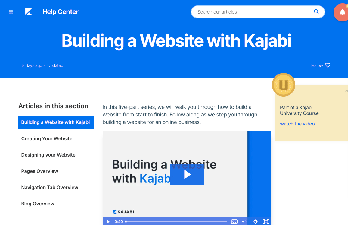
1. Amazon
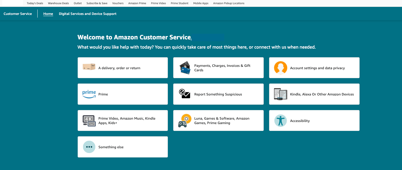
Amazon splits its FAQ section into ten categories.
Each section uses a graphic to easily distinguish the section.
Once a user clicks on the relevant section, it opens another page with more options.
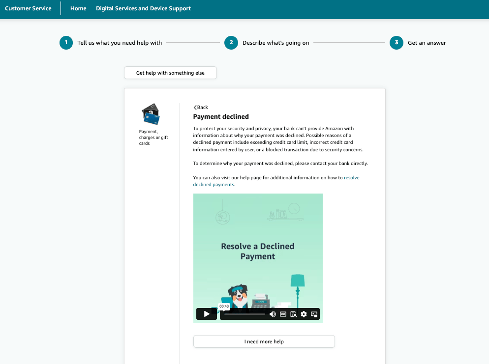
For example, if we click Payment, Charges, or Gift Cards, it opens up a list of popular issues. From here, we can select Payment Declined. The page then has detailed information on declined payments, a link to an article with more information, and a video that answers the question.
There is a button beneath the article titled I Need More Help. When clicked, this goes to a page with contact information.
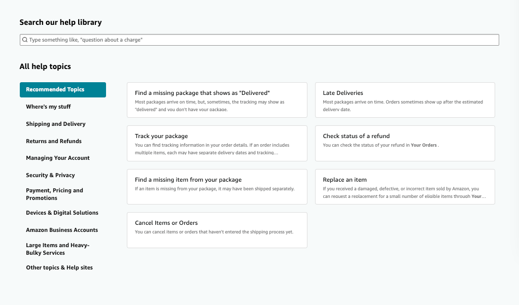
Amazon also has a help library. This is underneath the graphics.
Users can type in their problems, and it will populate articles that match the selection. Or they can use the menu on the left-hand side to find the question and answer they want.
The graphics, search bar, relevant results, text and video options, and additional links to more detailed articles make it easy for customers to find the information they need without contacting Amazon. But there is still the option for them to do so.
2. Pottery Barn
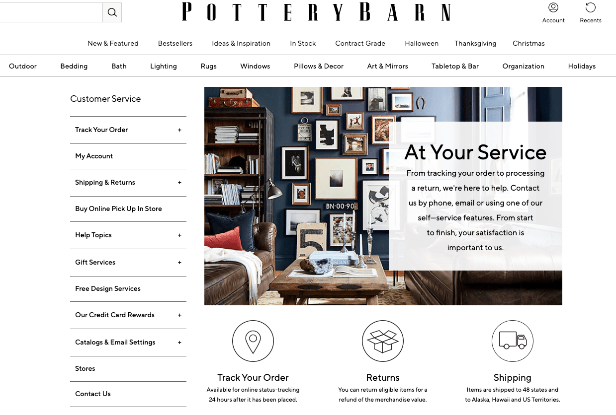
Pottery Barn is an American upscale furniture store.
Pottery Barn’s customer service page is simple and clean, fitting with their website and brand theme.
It uses one bold image with a text overlay that advises customers how they can get help and lets them know that their experience is important. This validates any customer concerns and can help put their mind at ease and increase brand trust.
The customer service page features an expandable menu on the left-hand side. Users can click on the + buttons to view the options for each category. They can then select the relevant option and will be taken to a page with all the details.
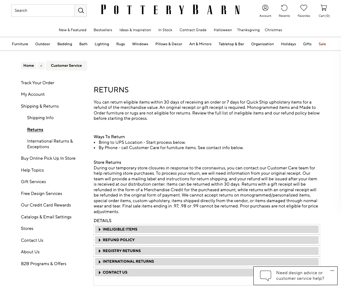
When they open the page, the expandable menu remains on the left-hand side. This makes it easy for customers to navigate other help pages.
There is also a Contact Us section at the bottom of the help page and a live chat button in the right-hand corner. This gives customers a final resort if they can’t find the help from the existing help pages.
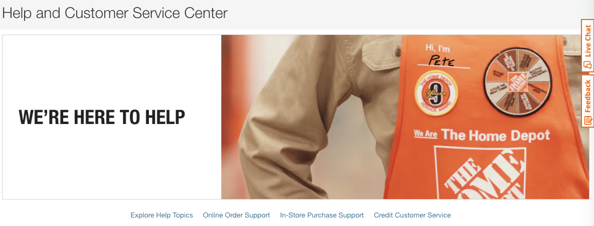
3. The Home Depot
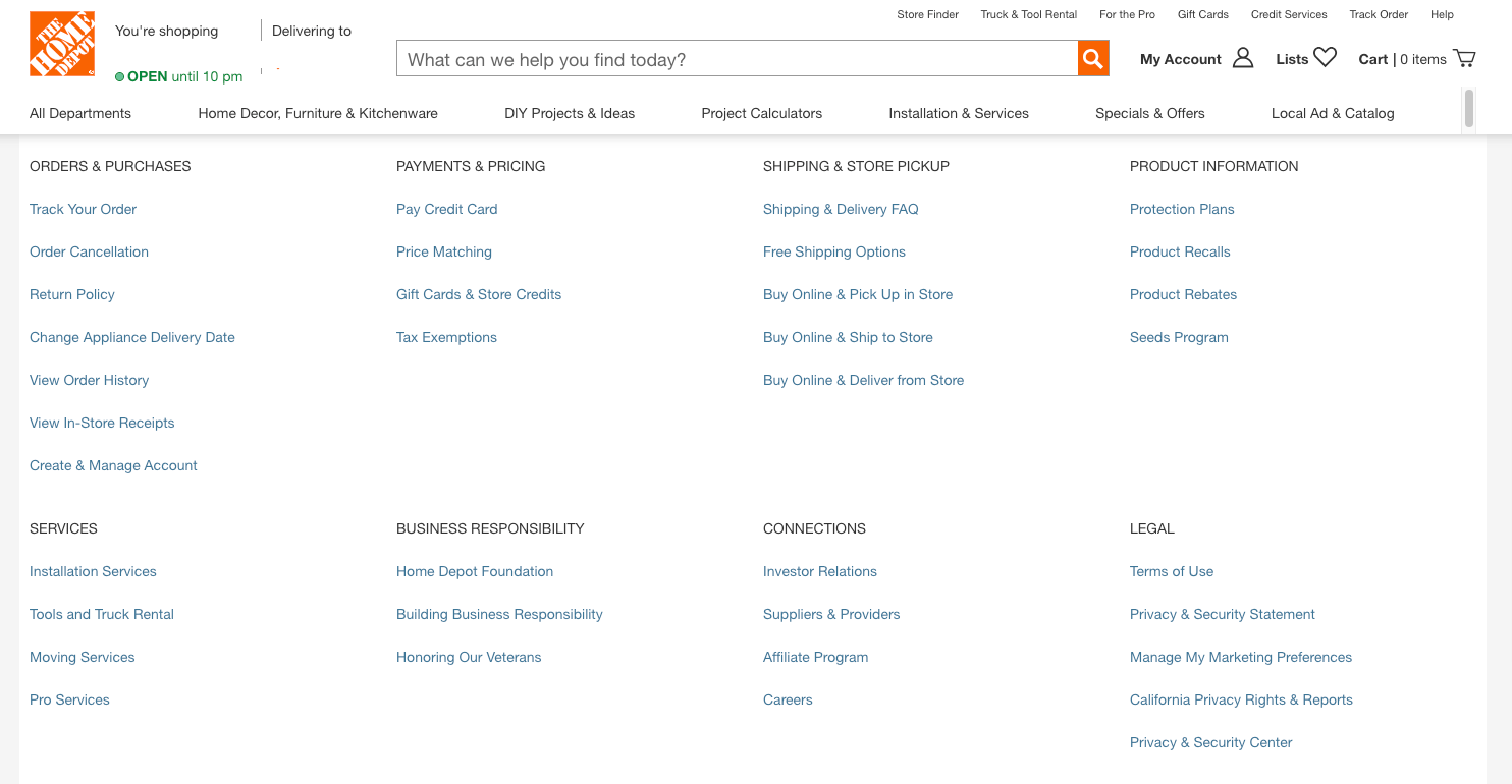
The Home Depot is the biggest home improvement retailer.
When you open the help center, there is an image of someone wearing The Home Depot apron with a name tag.
The orange aprons are easily recognizable and make the customer feel secure. The addition of the name tag also makes the customer service feel personal and almost like the user is in their local Home Depot.
Users can scroll down, and all of the help topics are categorized. When the user selects the most relevant topic, it will open a new page with all the details.
If you select the About Your Online Order help topic, there is a list of commonly asked questions at the bottom of the page that are expandable. The answers to these questions are short and simple, providing users with instant responses. This makes it easy for users to find what they’re looking for.
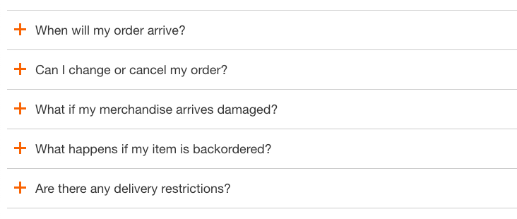
4. Bed, Bath, and Beyond
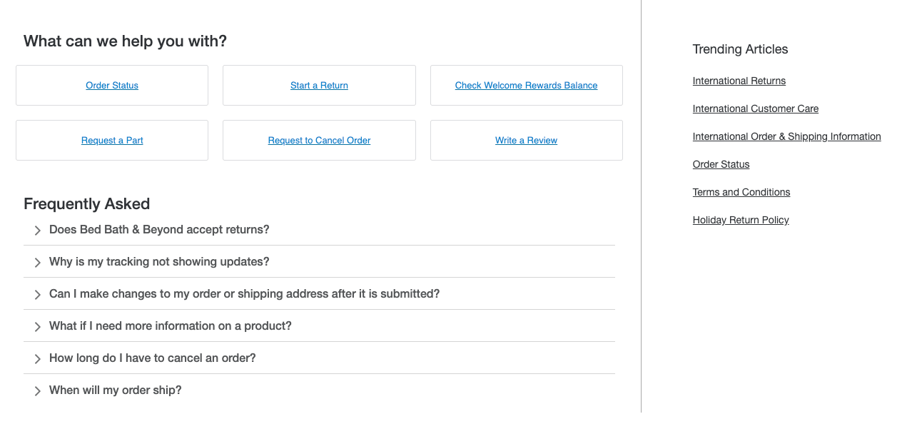
Bed, Bath, and Beyond is a homeware and furniture store.
The help center is accessed from the footer of the website. The help center splits the topics into categories to make it easy for users to navigate.
There is also a Contact Us button at the bottom of the page. When users click on the Contact Us button, it opens a pop-out window.
The window has all the help options and the frequently asked questions. This gives the customers a final way to resolve the issue themselves before contacting customer service. This can help limit the number of users that contact the brand, saving time and keeping costs lower.
If the help options don’t answer the questions, there are multiple ways to contact the team, including a chatbot in the lower right-hand corner.
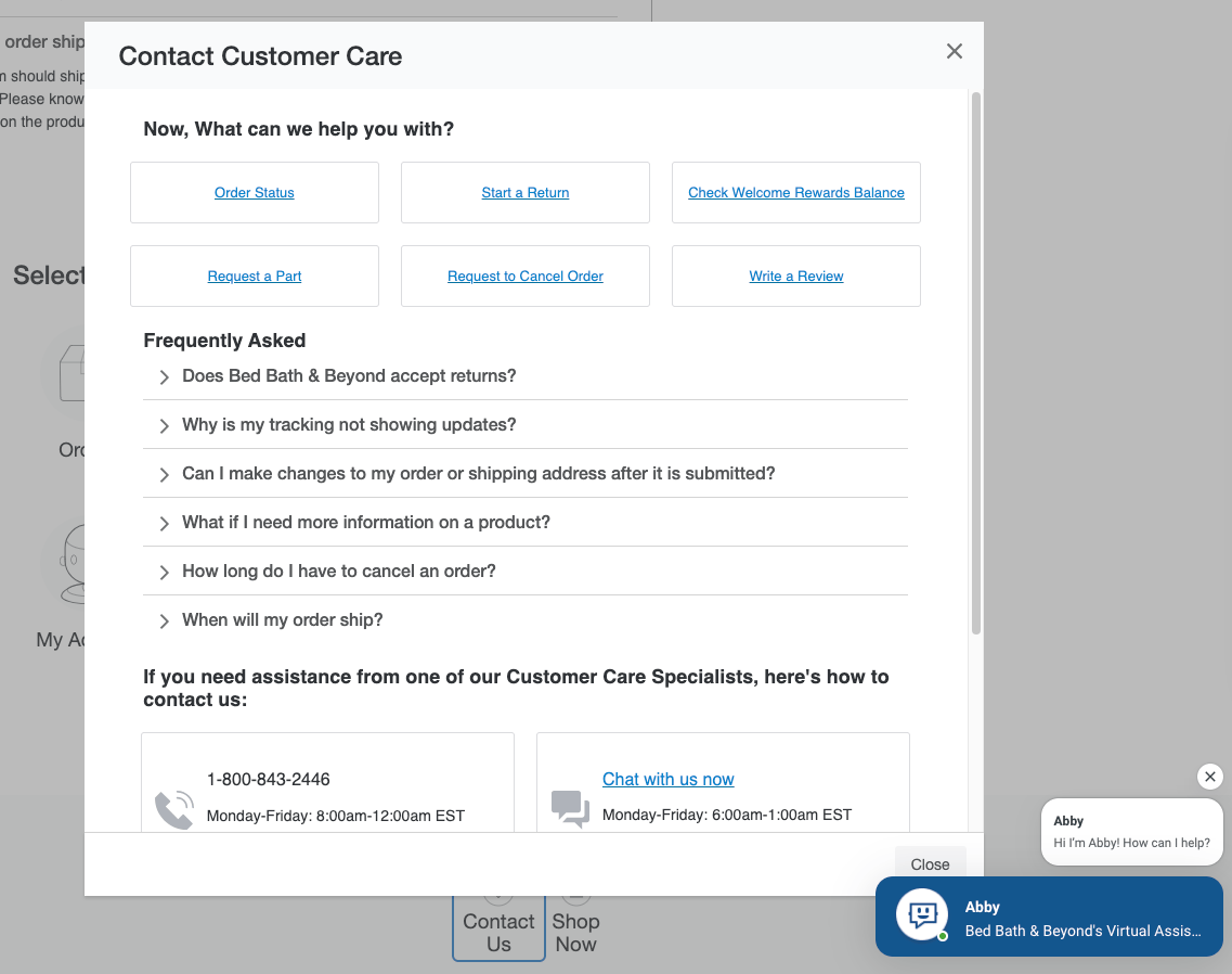
When you open the Bed, Bath, and Beyond help center, it doesn’t redirect you to the bedbathandbayond.com website but instead opens a new window of help.bedbathandbeyond.com/help.
This means that when a customer finishes on the help page, the Bed, Bath, and Beyond page, where they came from, is still open. They can continue browsing the site where they left off, which can help generate sales.
5. Target
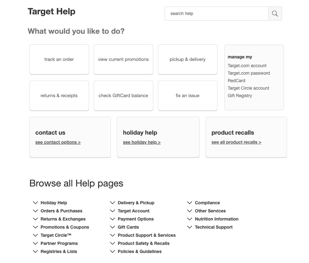
Target is the eighth biggest retail chain in the US.
There are several ways for users to find help, including the following:
- Search Bar - Users can type in their issue, and it will populate relevant results. A user can search through the results to find an answer to their query.
- Click Boxes - There are six boxes with the top most-searched-for issues. They are first on the help page and take up the most space. This makes them stand out and easy for a customer to see. A user can click on one of the boxes, which will take them straight to a help page with all the information.
- Dropdown Menu - At the bottom of the page, there is a list of all the help pages organized into categories. Users can click on the topic, and it will show all the articles in the section.
Every user is different, and giving them a variety of ways to get help can improve their experience with your brand.
6. Nike
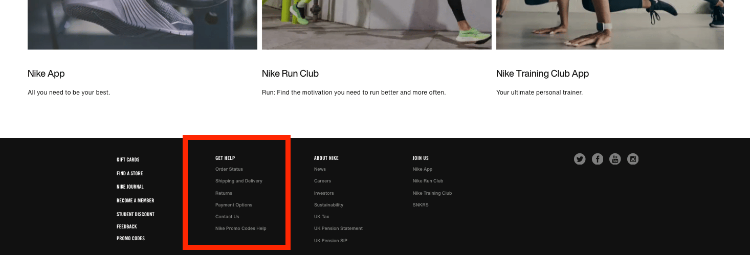
Nike is the biggest sportswear brand in the world.
The help center is accessed through the footer menu on Nike’s website. The option you choose will determine the page that opens.
Each option has an FAQ section with questions relevant to the option chosen.
Separating the FAQs by section makes it easy for customers to find the answers to their questions.
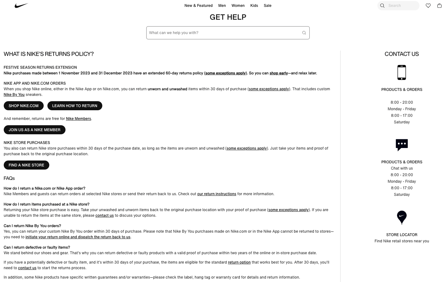
Each page also has a help search bar, so users can search for other topics they need help with, as well as a contact section if the user can’t find the results they need.
However, Nike doesn’t have a dedicated help page like the other e-commerce stores we’ve looked at so far. This does make it difficult to navigate between the help pages for users, as they need to do another search for each issue.
7. American Eagle Outfitters
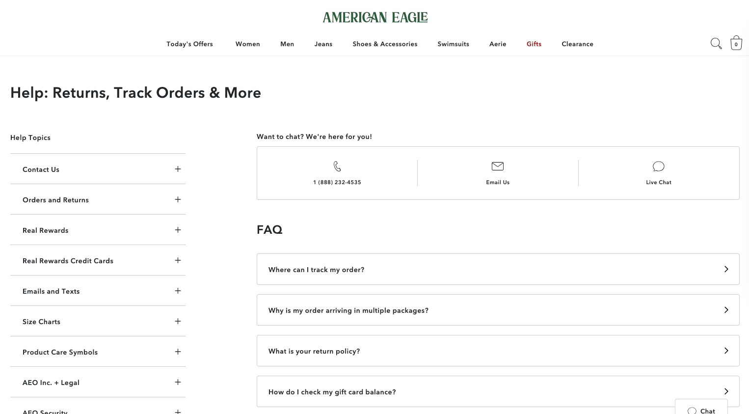
American Eagle is an American clothes and accessories store. The e-commerce store has a help page that has an FAQ section.
The FAQs ae all common questions, which, when the question is clicked, take the user to another page that has the answer.
If a user's question isn’t answered in the FAQ section, they can use the left-hand menu. This lists all of the help topics. Users can click on the + to expand the topic and find their issue.
When the page opens, the left-hand menu is still visible. This makes it easy to navigate between different topics.
At the top of the left-hand menu, there is a contact option. This lists four ways to contact the American Eagle team. These contact options can give users peace of mind, as they know they can always reach out to the team if their question isn’t answered.
8. H&M
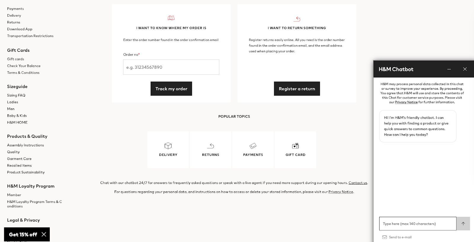
H&M is a clothing, home, and accessories site with stores worldwide.
Its help center aligns with its branding, using the same fonts and colors as the website. They use red to highlight the help topic selected.
As you click on each help topic, it opens a page with frequently asked questions. The questions have a quick answer and then a link to a full article with more information.
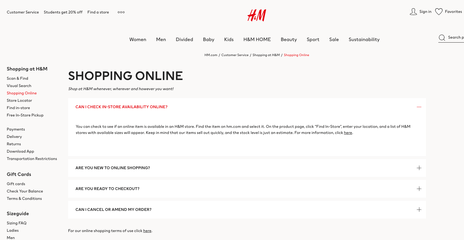
This makes it easy for customers to scan the answer and either find out what they’re looking for or locate the article with all the details.
If the customers can’t find the answer they’re looking for, H&M has a 24-hour chatbot.
The chatbot works like a help center search bar, but the chatbot makes users feel like they’re interacting with a real person. This can increase the customer's satisfaction and also make it easy for a customer to be redirected to an agent if needed.
9. Best Buy
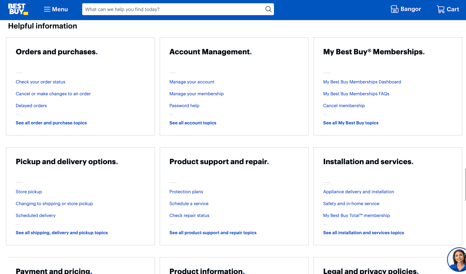
Best Buy is an American electronics retailer.
The help pages are the same color theme as Best Buy’s website, making it cohesive.
All of the questions are split into categories, making it easy for customers to navigate.
They also have a customer service chat icon in the lower right-hand corner. The image is of an approachable and friendly-looking Best Buy employee. Seeing the employee the user is interacting with makes the service more personal and allows the user to connect with the brand.
10. Fashion Nova
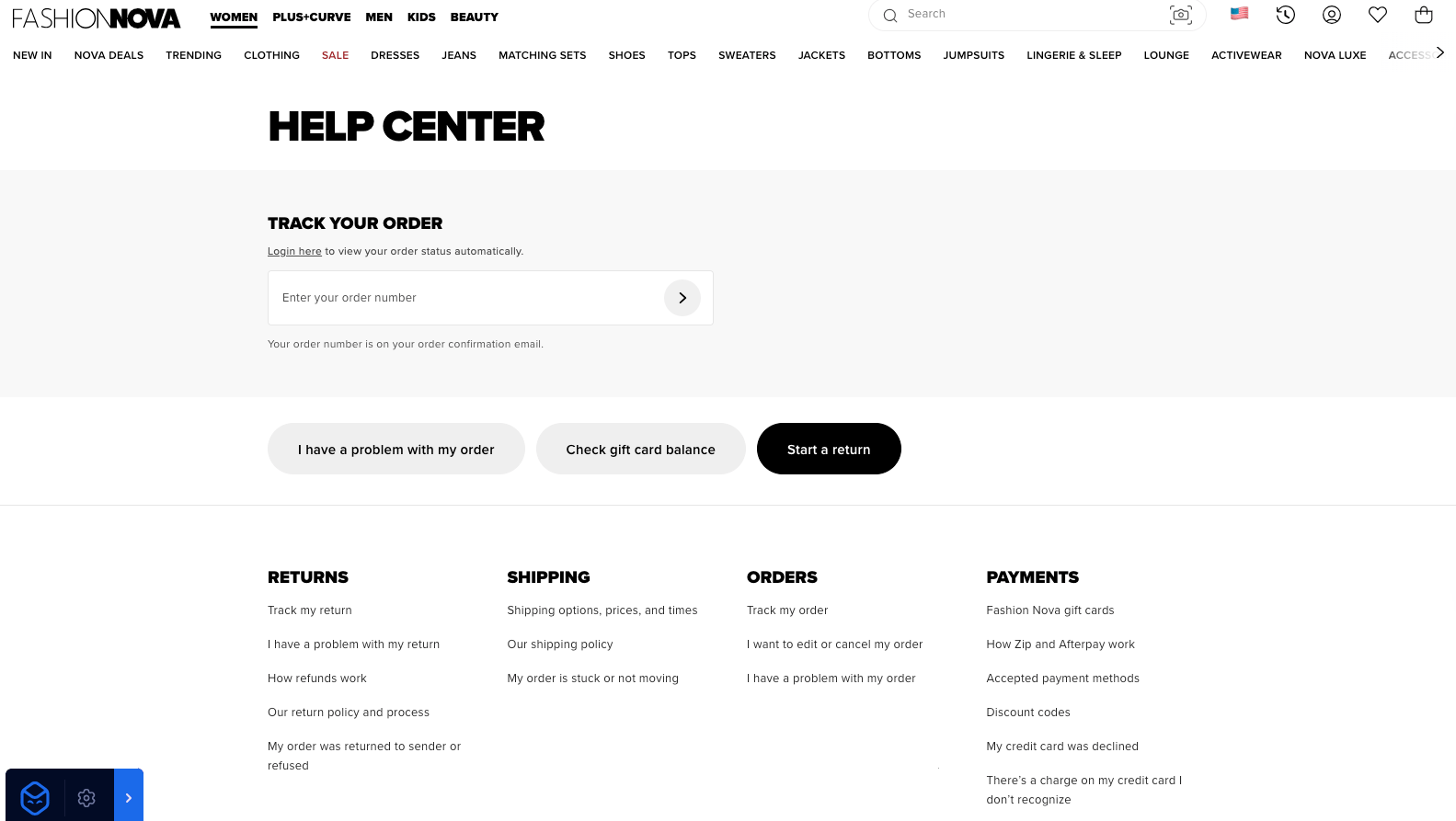
Fashion Nova is an American fast fashion brand. They have five stores in the US, but the majority of the sales are made through their website. They ship to many countries worldwide.
Its help center is in keeping with the website's monochrome theme, and it has a clear layout.
It has a tracking box first and then three buttons. We assume that these are the most common reasons users use Fashion Nova’s help center, and therefore, they’re easy to find.
Unlike other sites we’ve looked at so far, its contact support option is more discrete. And to contact support, you have to answer two questions to access the support form. There is also only one way for users to contact support, and this is by submitting a form.
This will likely keep Fashion Nova’s costs down, which might be how they can provide such cheap products. However, it isn’t usually a customer's preferred way to contact support. Users usually want an instant reply, and this requires them to wait for an email. It also doesn’t allow a conversation to flow like a phone call or messaging, which can be frustrating for customers.
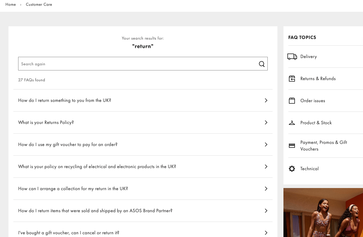
11. Asos
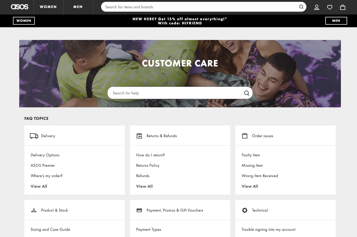
ASOS is a British online retailer that ships worldwide. They sell primarily clothes, cosmetics, and accessories aimed at young adults. ASOS sells its own products, as well as stocking many big brands like Nike, Adidas, Clinique, GHD, Ugg, and many more.
The help center is called Customer Care on ASOS. Adding care to the name helps customers feel like they will be looked after and cared for if they have any issues. This can increase the brand’s credibility and build customer trust, which can boost sales.
The help center features several FAQ topics and a search bar, making it easy for users to find what they’re looking for.
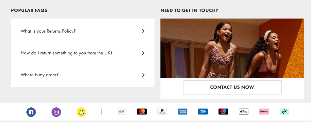
Underneath the FAQ topics, there is a popular FAQ section and a Contact Us button.
The FAQ topics and popular FAQ section all have three options. To access more options, they need to click another button or use the search bar.
Adding only three options helps the user not feel overwhelmed by choices. This can increase satisfaction, as users don’t feel like they need to hunt for a resolution.
When a user clicks on any of the FAQs, it will provide an answer, and below the answer, there are related FAQs. If the answer provided isn’t quite what they’re looking for, they can use the related FAQs to find the right answer.
12. Kylie Cosmetics
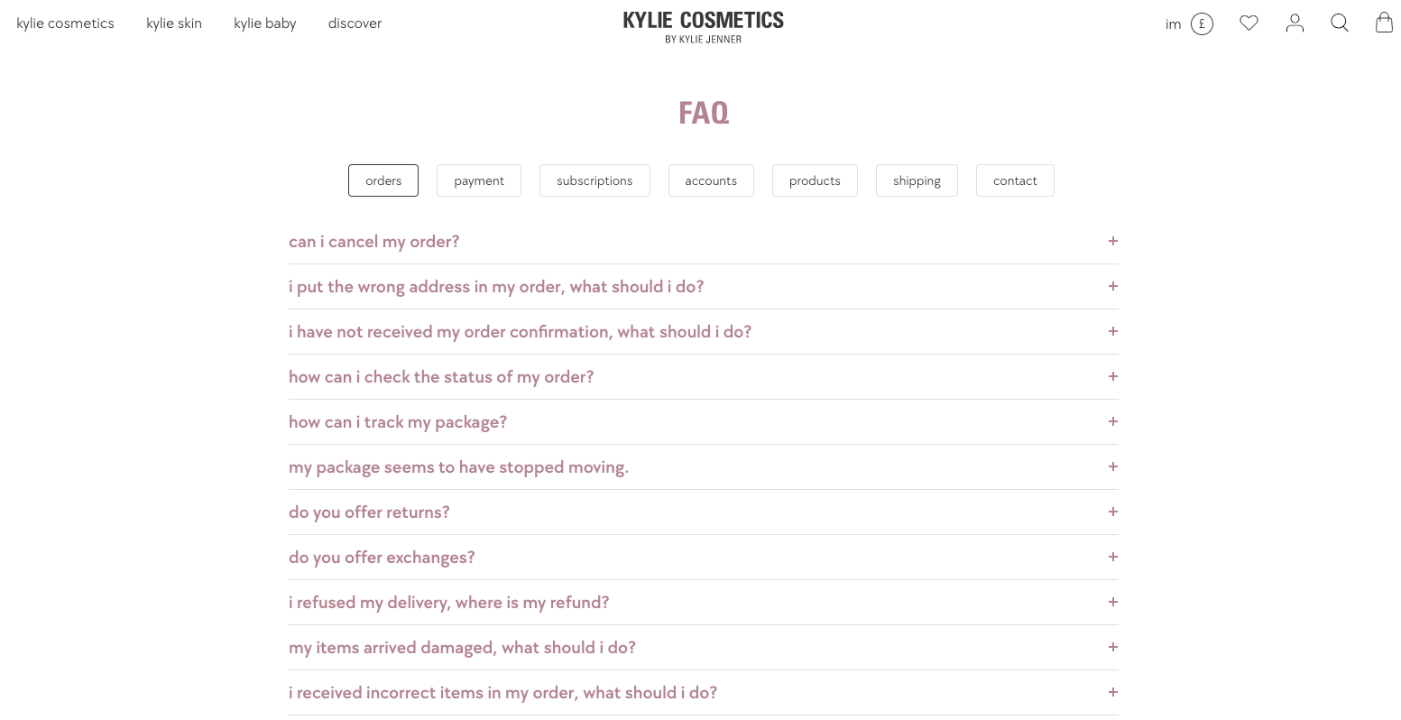
Kylie Cosmetics is a cosmetics and skin brand that has hit headlines in recent years due to its valuation of over a billion. The brand is partially owned by social media influencer and reality star Kylie Jenner.
The FAQ page uses the same colors and fonts as the rest of the site, and they use only lowercase letters on the topics and questions, which is the same format as their menu, product titles, descriptions, and other text. This helps create a cohesive website and enhances the brand’s identity.
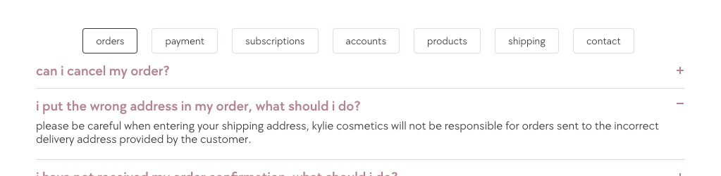
The page looks simple, with seven tabs along the top and a list of questions below that relate to the selected tab.
When the questions are clicked on, the answer is shown. The answers are less informative than some of the other examples we’ve looked at, and some lack a real resolution.
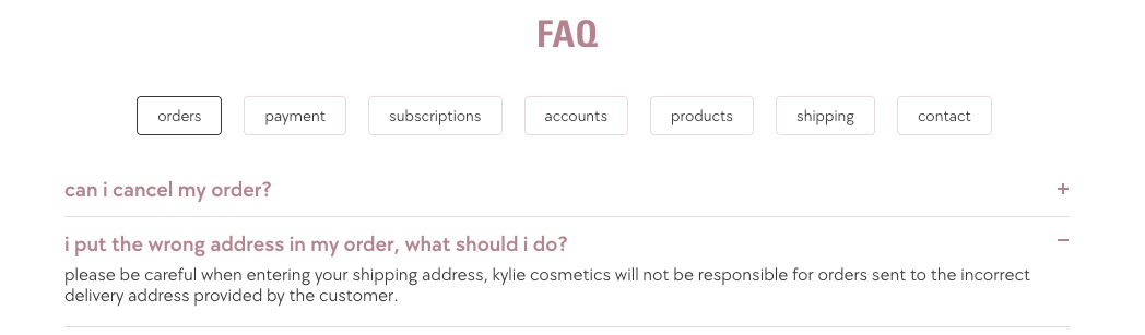
For example, the question, ‘I put the wrong address in my order, what should I do?’. The answer provided doesn’t answer the question. Instead, it says they’re not responsible and to be careful when adding your address. There is no more information or even a contact us option.
This is a totally unhelpful response, and rather than answering the question, it berates the user.
The user is probably already stressed about potentially losing their parcel. This type of response will cause more frustration and increase user friction, which can reduce the trust they have in the brand and reduce sales.
If this was our FAQ page, we would try to offer a solution. For example:
- Pre-Shipping - We would ask them to contact us, and we can change the address or cancel and refund the order, and they can reorder with the correct address.
- Post-Shipping - We could contact the shipping company to see if we could change the address. Or send the customer the tracking details and contact details for the shipping company so they can contact them themselves.
If it isn’t possible for the shipping company to change the address, there are two options.
- Offer no solution, as it’s their fault (like Kylie Cosmetics). This might upset customers but doesn’t come at any cost to you.
- Take the correct address and send a replacement. This option will increase your customer satisfaction but is an additional expense.
The choice will depend on your business. You might want to build a brand that customers return to and recommend. Alternatively, you might have a more short-term approach, with a focus on generating as much profit as possible.
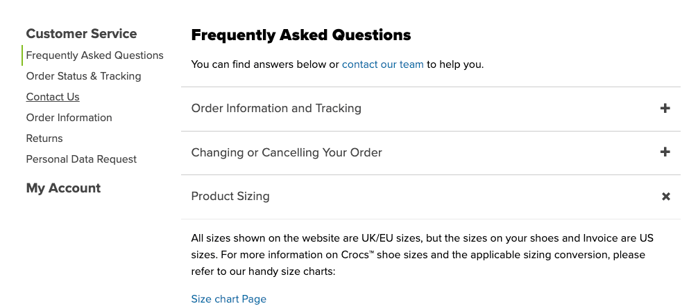
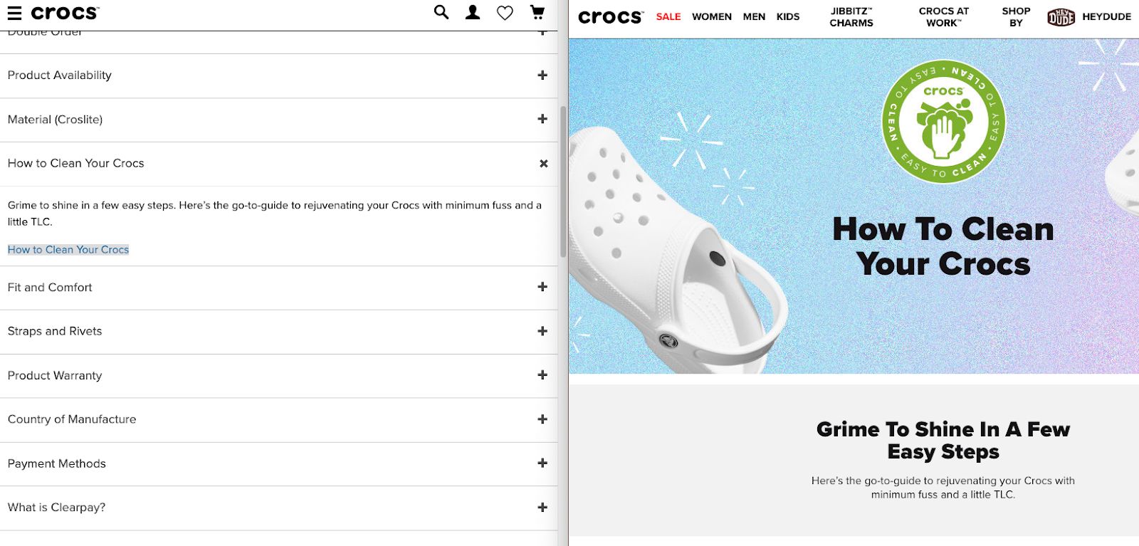
13. Crocs
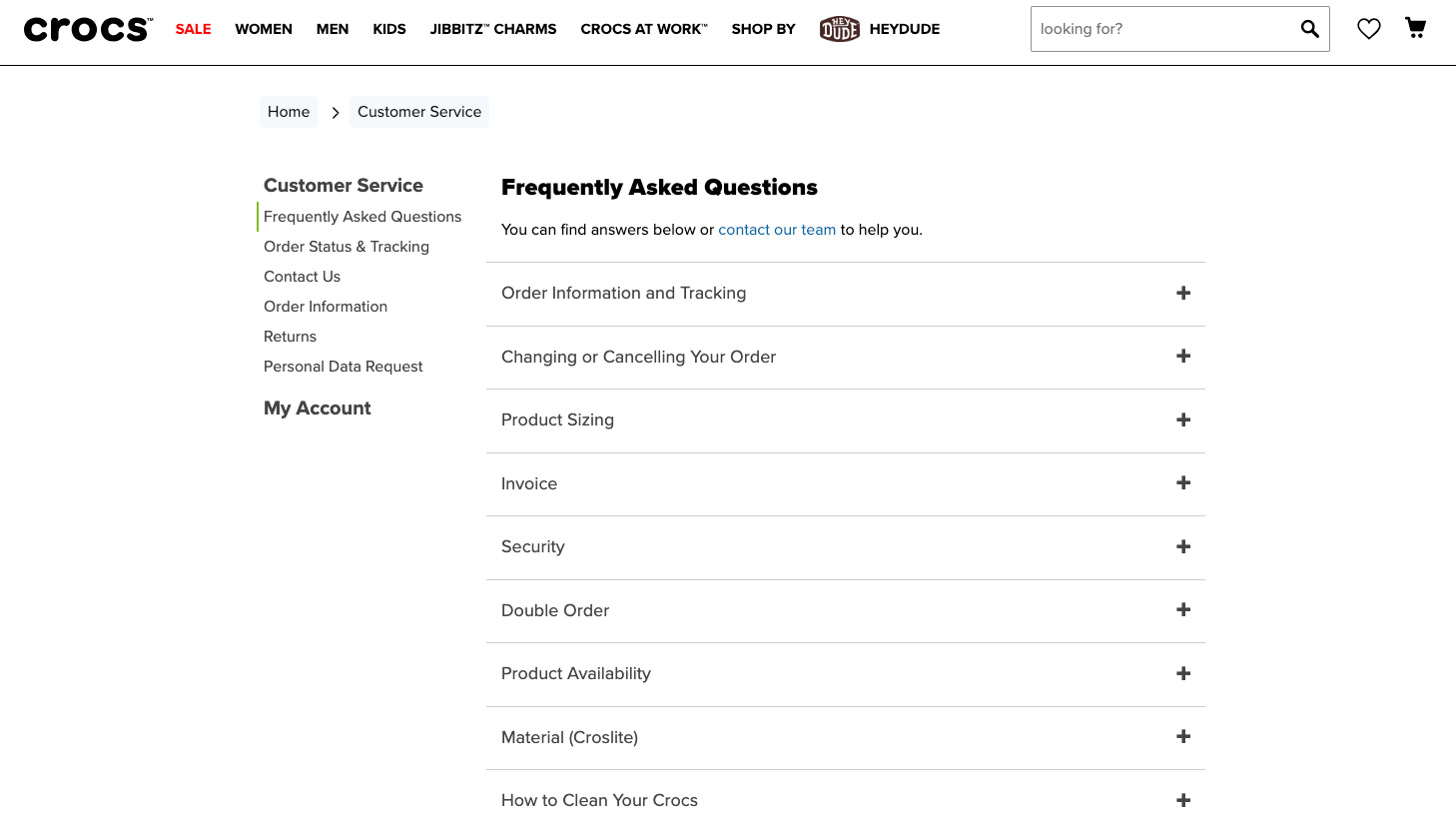
Crocs is an American shoe company that sells clog-style shoes.
The Crocs FAQ page is simple and clean. Users can click on the question, and it will display the answer underneath. The user isn’t redirected away from the FAQ page when they select a question. This makes it easy for users to move between questions.
Each answer is simple and links to any relevant content. For example, the product sizing question is answered instantly. But it also has a link to a sizing chart on another page if needed.
Answering in this way gives the user instant information, which is often all they’ll need. But there is additional information easily accessible if they need it.
It will save the Crocs team time, as customers don’t need to reach out for basic answers.
Crocs also clearly shows how users can contact the team. There are two buttons on the FAQ page.
The contact button at the top of the page says that users can either find the answer below or contact the team. The placement of the contact information and wording makes customers feel at ease if they do need to reach out.
Often, sites will hide their contact information or force users to complete multiple questionnaires to get through to the team, which can be annoying for a customer and make them feel like a burden.
Crocs doesn’t do this and allows customers to freely contact them in several ways, which can increase a customer's experience with the brand.
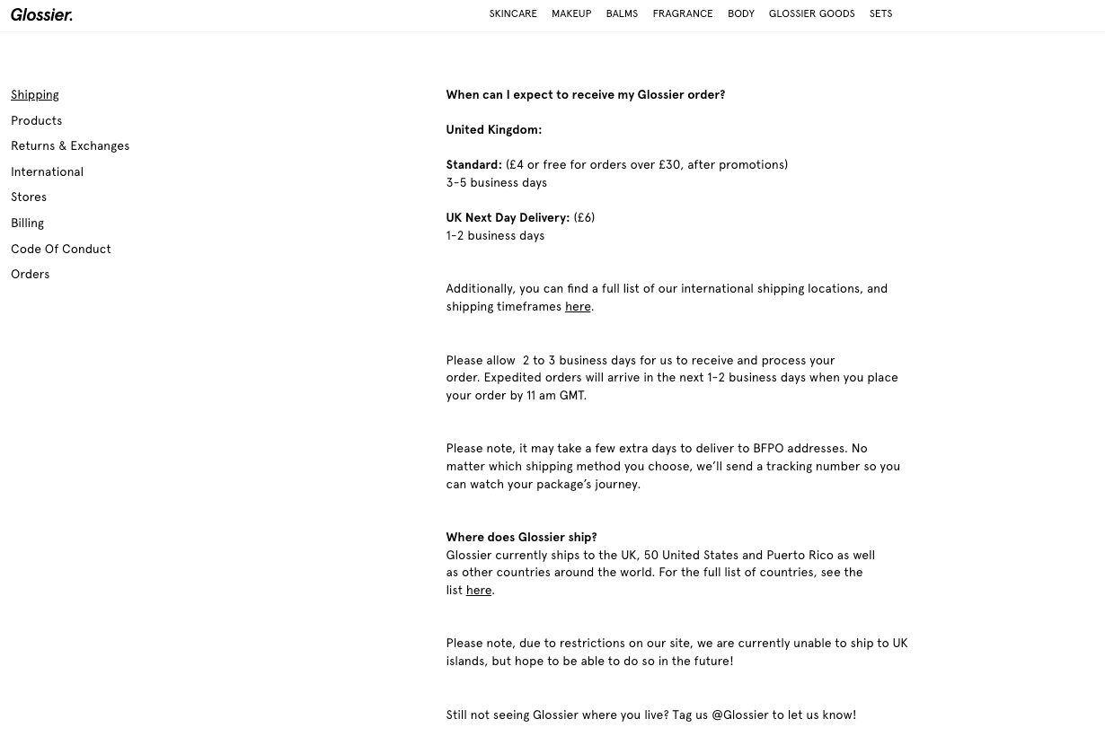
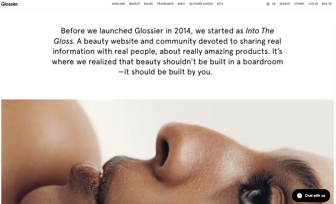
14. Glossier
Glossier is an American beauty brand that started as an online beauty community.
The brand ships internationally and has several brick-and-mortar stores in the US and UK.
The FAQ page is basic, with a list of topics on the left-hand side. When the topic is clicked, it opens a page with questions and answers written in a block.
There is no fancy search feature or expandable questions and answers, like many of the other e-commerce FAQ page examples we’ve looked at.
This does make it slightly harder for users to find the question they are looking for, as they need to scroll down and pick out the question from the block.
However, the block-style text is fitting with its beauty blog and community origins. It also uses text like ‘mainland UK friends’. This also reinforces the relationship Glossier has with its audience and community, which helps solidify its brand identity.
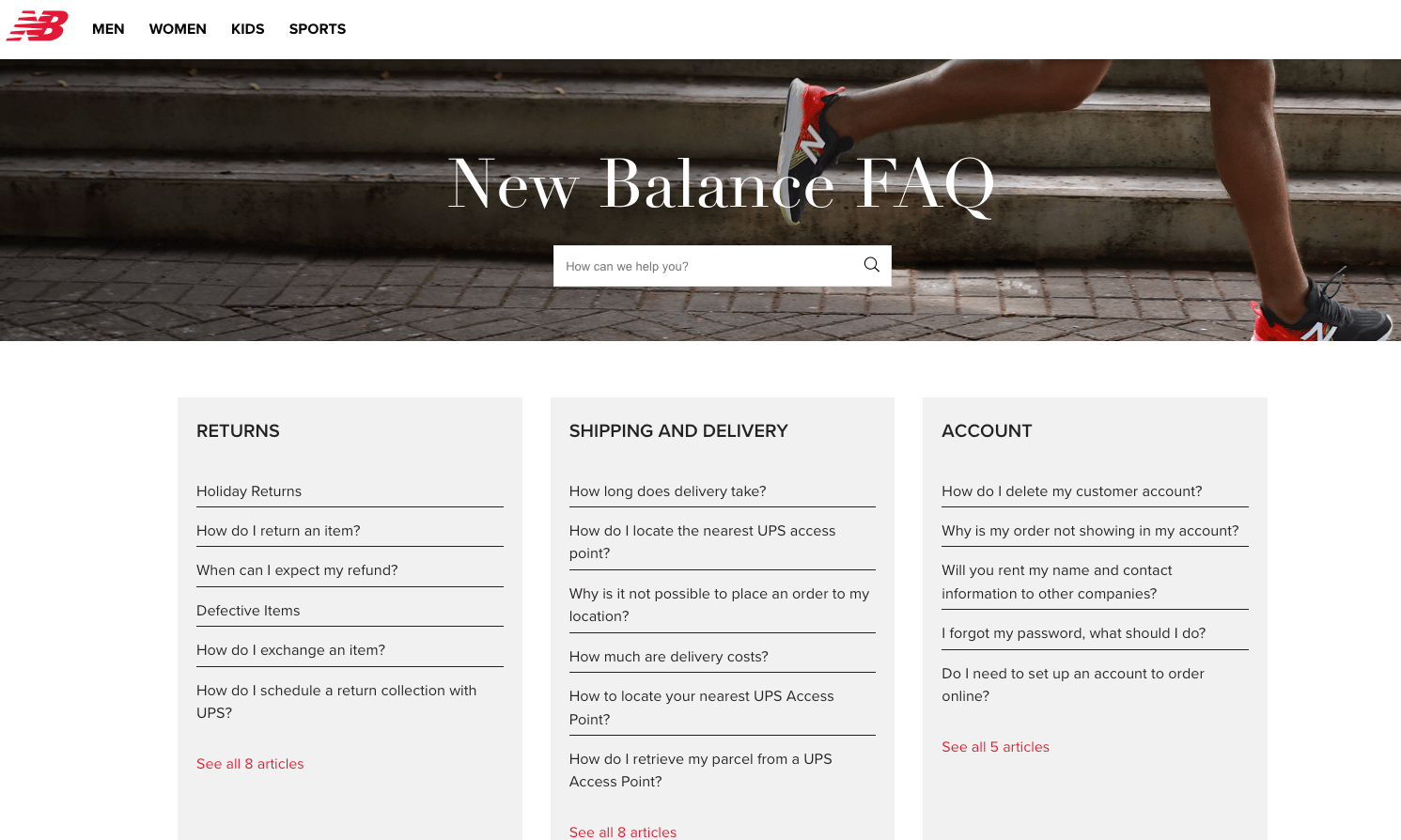
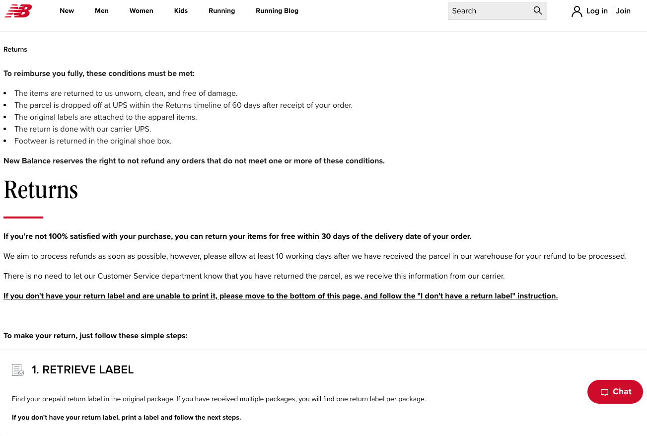
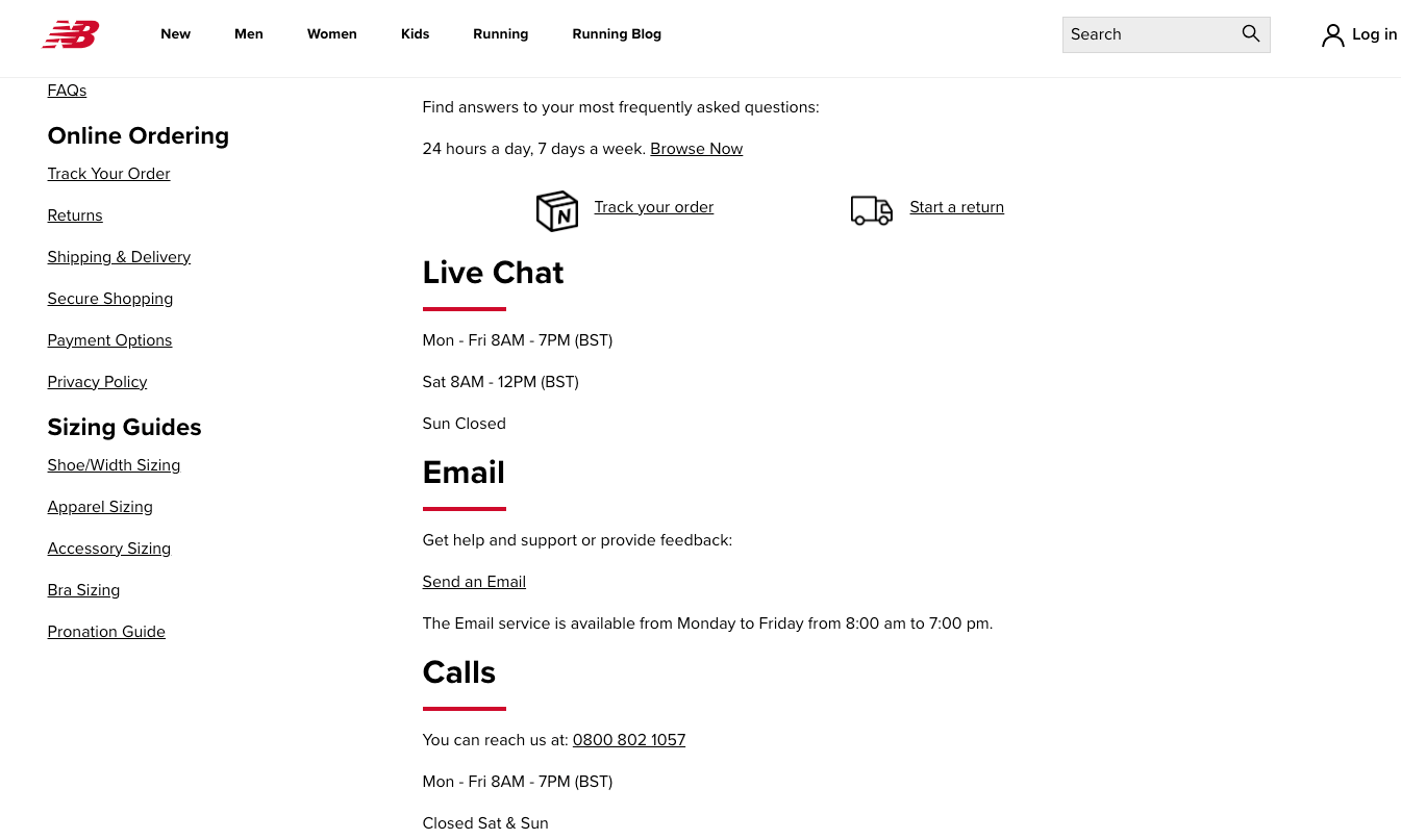
15. New Balance
New Balance is a sport, fitness, and lifestyle footwear and clothing brand.
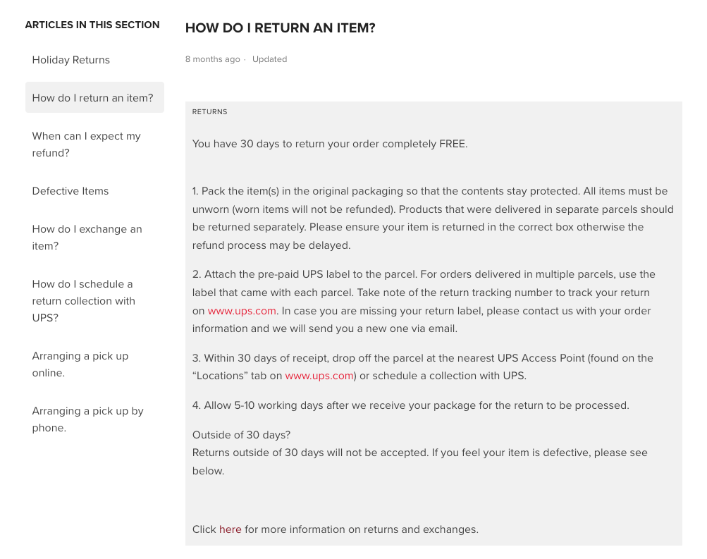
Its FAQ page is separated from the main website. The FAQ page is operated through Zendesk. Zendesk is a customer service software. We know this as the domain changes from newblance.com to new-balance.zendesk.com. This does make it slightly more disjointed than other FAQ pages we’ve looked at.
For example, they have a basic answer for returns on the FAQ page. But they have a complete step-by-step for returns on the New Balance site.
There is also a button to contact the New Balance team on the FAQ page. But the only contact option is a contact form.
This is not the same as the Contact Us option available on the main site. The main site allows you to contact New Balance by phone, email, and live chat option.
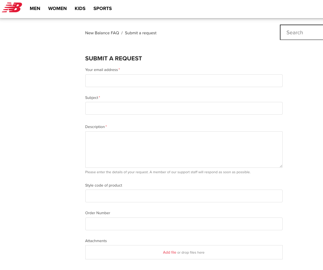
This is a bit annoying for customers as they have to jump between the FAQ page and return to the main site.
It might also be confusing and time-consuming. For example, if they’re looking for help on the FAQ page, they might submit a form and wait for a reply. But if they were on the main website, they could reach out to the team via phone or live chat for an instant response.
New Balance’s FAQ page is organized into four categories to make it easier for the user to find what they need help with.
When a user clicks on one of the questions, it opens a new page with the answer to the question.
The answers also have links to relevant sites (e.g., for returns, it links to UPS) and to other pages on the New Balance website (e.g., the returns page.)
Underneath each answer, there is a button that asks whether the answer was helpful. This is a good way for New Balance to get feedback on their answers so they can make improvements.
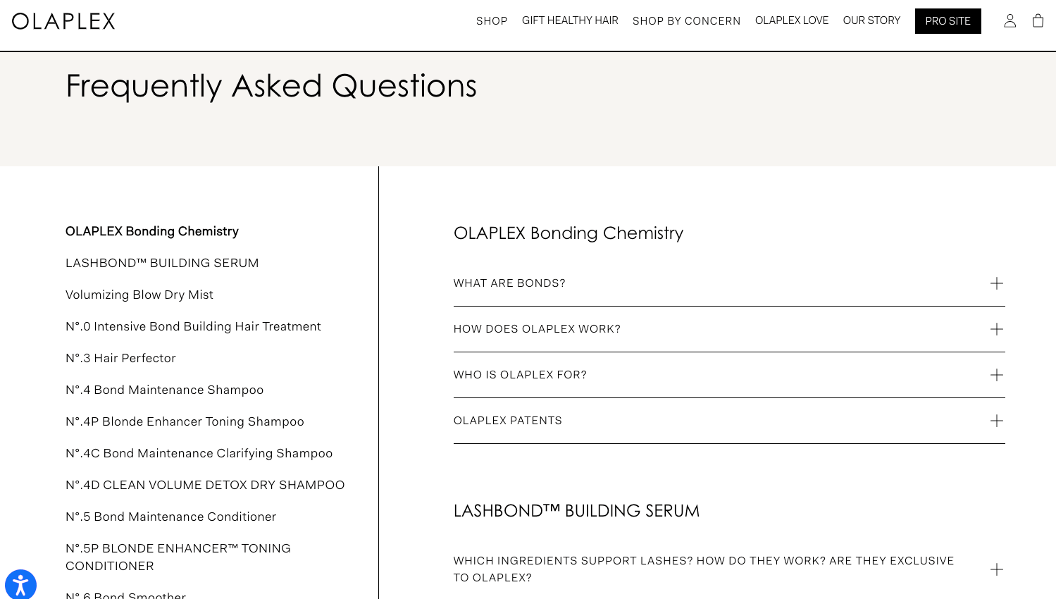
16. Olaplex
Olaplex is a high-end hair care brand made famous by celebrities like JLo and Jennifer Garner.
Its frequently asked questions are all questions about the products and brand, rather than orders, returns, shipping information, etc., like other e-commerce stores' FAQs we’ve reviewed.
The FAQ page uses neutral colors and the same fonts and format as the rest of the site, making it recognizable. This helps to build the brand’s identity.
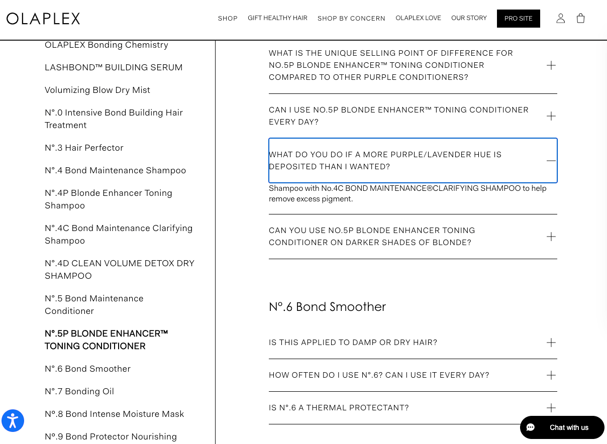
All of the questions are displayed on the right-hand side of the FAQ page. The user can scroll through the questions to find what they’re looking for.
The questions are organized into products and topics, and when the question is clicked, the answer appears underneath. This keeps everything on the same page, making it easy to find the answer to the question without having to go back to find the answer to another question.
The left-hand menu includes all of the products and topics. These can be clicked to show the questions in that category. The product or topic is also highlighted as the user scrolls through the questions to show which category they’re in.
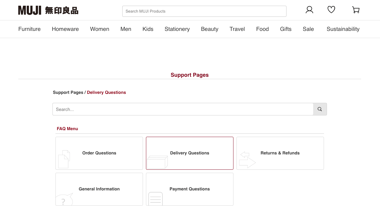
17. MUJI
MUJI is a Japanese brand that sells household products, clothing, accessories, and stationery.
It’s known for its organizational products, which are simple and multi-purpose.
The FAQ page clearly represents brand personality, with a clean and simple design and using the same maroon color as the logo and labels.
The top of the page has a search bar, so users can enter their questions and will be shown relevant results.
Underneath, there is a menu with five question categories. When a user clicks on the category, it shows the related questions below.
They can then expand the questions to reveal the answers.
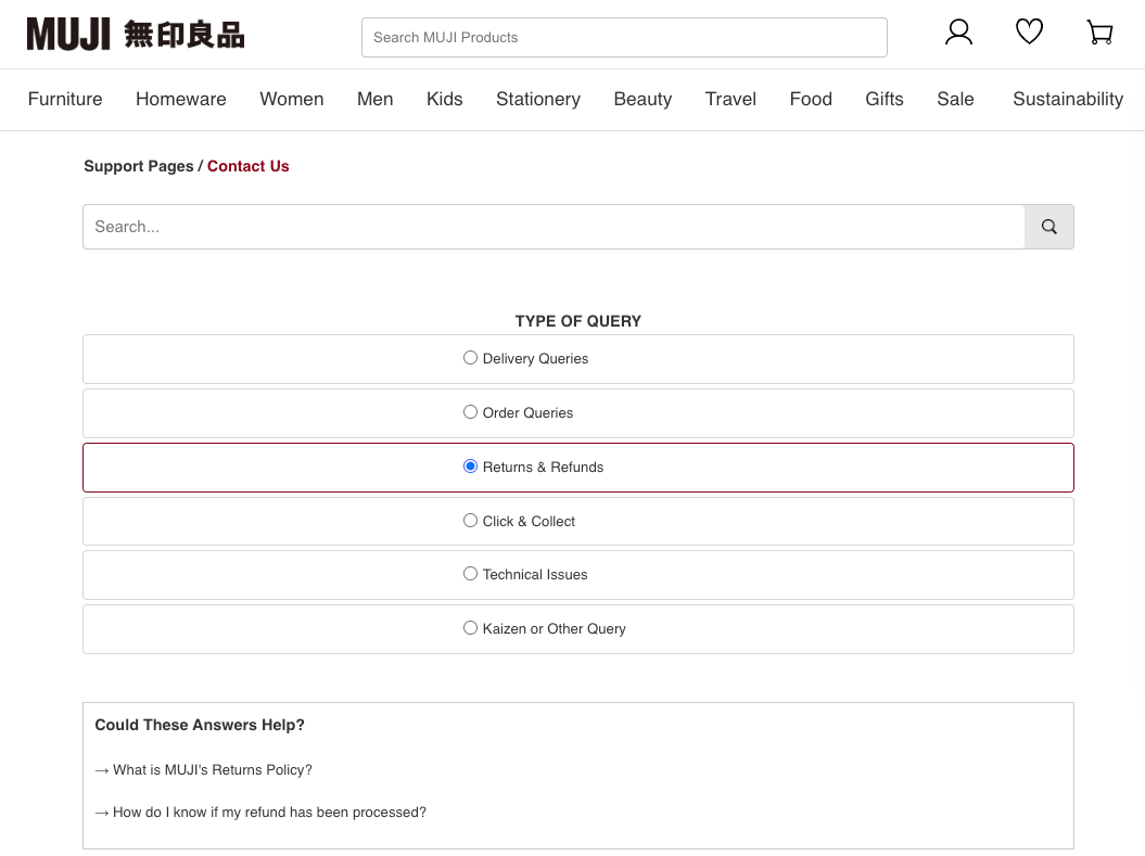
The format of the FAQ page makes it very easy for users to navigate, and if they can't find the answer to the question they have, there is a Contact Us button.
This button takes users to a contact form. To complete the form, users need to select what type of query they have and check related support pages before filling in the details.
MUJI doesn’t advise how long it will take to receive a reply, but it does state that the team is very busy. This does help to set the customer's expectations. However, it can make the customer feel like their query isn’t important to the MUJI team. There is no live chat or phone number available.
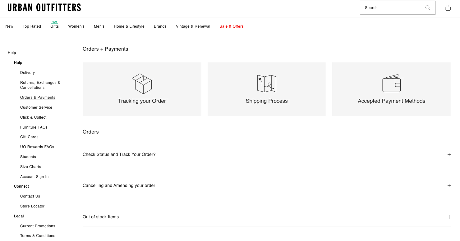
18. Urban Outfitters
Urban Outfitters is a fashion brand with physical stores in various countries and shipping worldwide from its online e-commerce store.
There is no main FAQ menu page. Instead, the user has to select the topic relevant to them from the footer to access the topic.
After they’ve selected a topic, it will appear with all the information, along with some questions and answers.
It will also display a menu on the left-hand side with all of the help topics. This means that once they’ve opened one topic, they can easily switch to another.
Urban Outfitters has all of the information included here. This contrasts other FAQ pages we’ve looked at, which answer the question in short and provide a link to the in-depth answer.
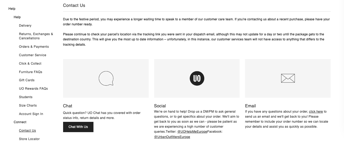
If a user can’t find the answer to their question, Urban Outfitters makes it easy to contact the team with a Contact Us button in the left-hand menu and underneath the customer service topic. From here, you can choose to chat, email, or connect with the team on social media.
19. Jacamo
Jacamo is a men's clothing brand with sizes from S to 6XL. They have their own brand and sell popular brands, like Ralph Lauren, Adidas, Calvin Klein, and many more.
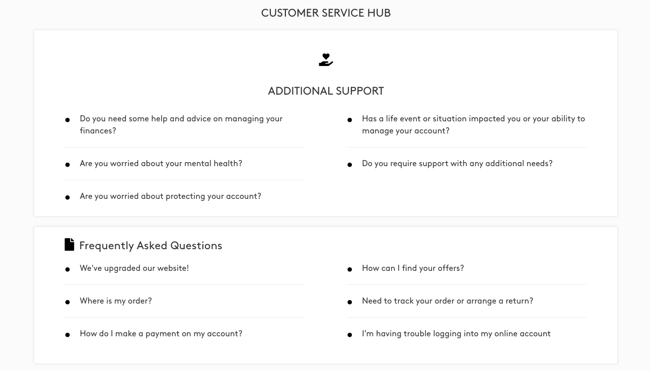
The Jacamo Customer Service Hub includes a search bar, an additional support section, FAQs, a help center, and contact details.
The additional support section includes questions that aren’t directly related to Jacamo orders, such as managing finances, supporting additional needs, significant life events, and mental health. This section goes above and beyond and clearly shows the inspiring values the brand has.
Underneath the additional support section is the FAQs. Users can click on the question and will be taken to another page with the answers. The answers are concise and provide links that go to pages with more information.

Below the answer, there is a related articles section, which has the details on how to contact Jacamo. At the top of the contact page, there is a line that says, ‘Our friendly customer service team is always happy to help.’ This helps to set the tone of the conversation and should help boost the customer's experience.
20. Nordstrom
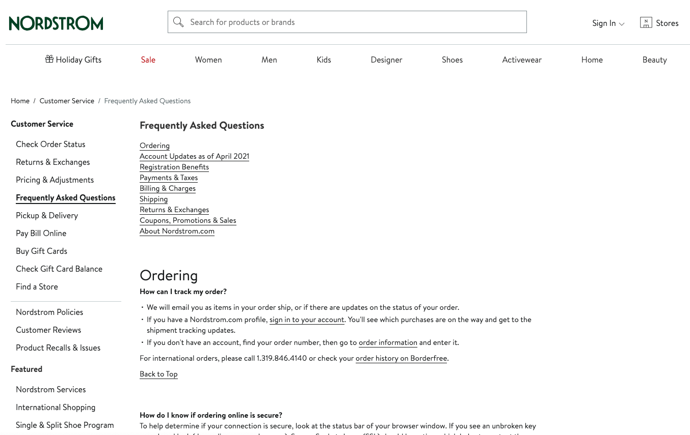
Nordstrom is an American department store that sells clothes, shoes, and accessories for men, women, and children.
They have over 350 brick-and-mortar stores and sell their products online through their e-commerce store.
The FAQs are available under the customer service section in the footer of the website.
When clicked, a menu with all of the customer service options appears on the left-hand side, and the FAQs are in the center.
The FAQ page is pretty basic. It is essentially a long list of questions separated into categories. There is no search function or expandable answers. This can make it a bit more challenging for the user to pick out the exact information they want. But there is a clickable list of the categories at the top of the page.
The answers are all short and provide links. The links take users to other pages with more information.
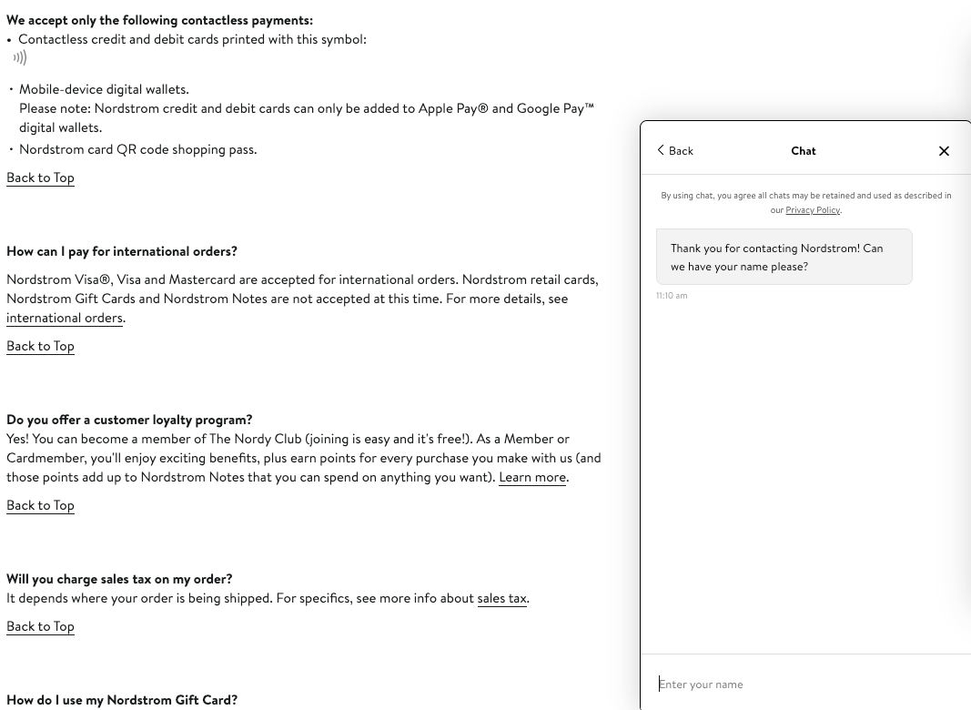
If a user can’t find the information they’re looking for, there is a chat icon in the lower right-hand corner. This opens a live chat, where users can talk with a customer service representative.
21. Ralph Lauren
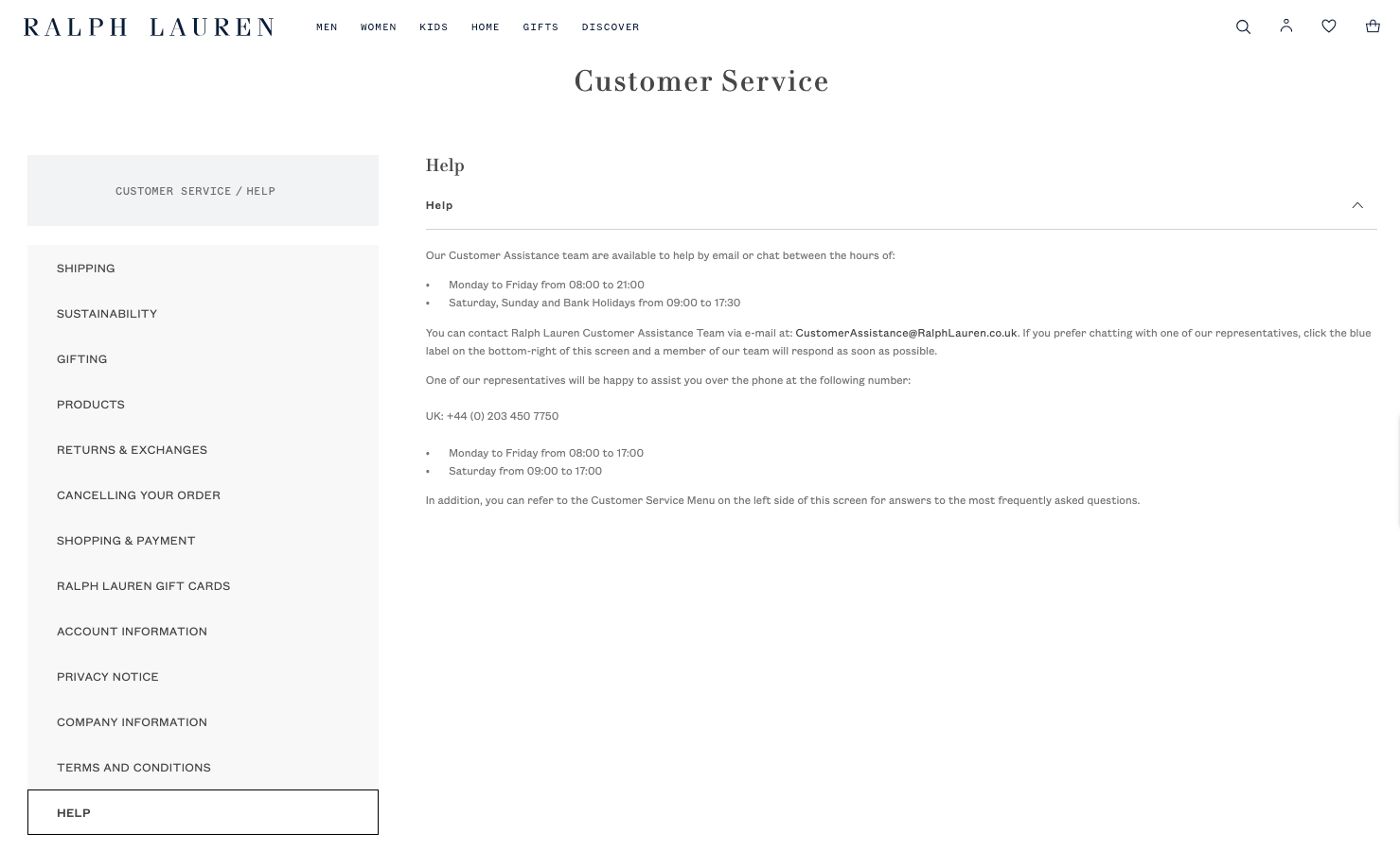
Ralph Lauren is a mid-range to luxury American fashion brand that sells clothes, accessories, and homeware products.
The FAQs are in their customer service section.
The customer service section uses a navy and gray color scheme, which is in keeping with the rest of the website. It also uses the same fonts and has a clean and sleek look, which matches the brand’s aesthetic.
On the left-hand side of the customer service section, there are multiple categories.
Once a category is chosen, a user can click on a question within the category, and the answer will appear below.
This makes the Ralph Lauren customer service section super easy for users to navigate and find the answer they’re looking for.
Underneath the categories, there is contact information if users need additional help. There are two options for help: a phone number and an email address. Giving users options and control over how they contact you can improve their experience.
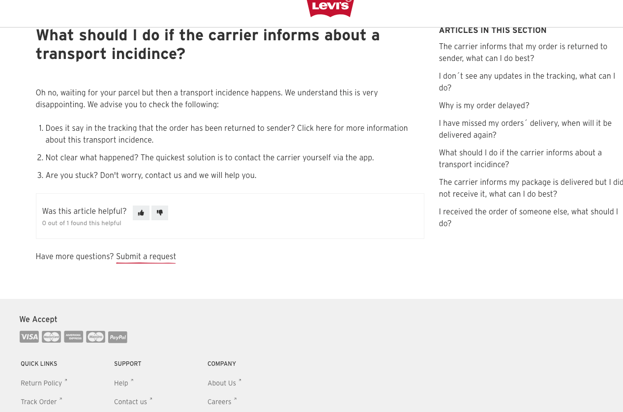
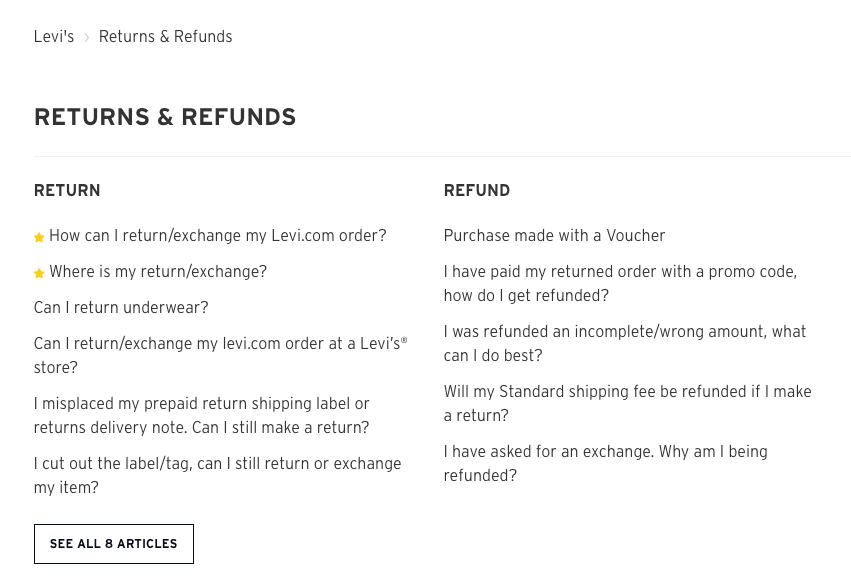
22. Levi
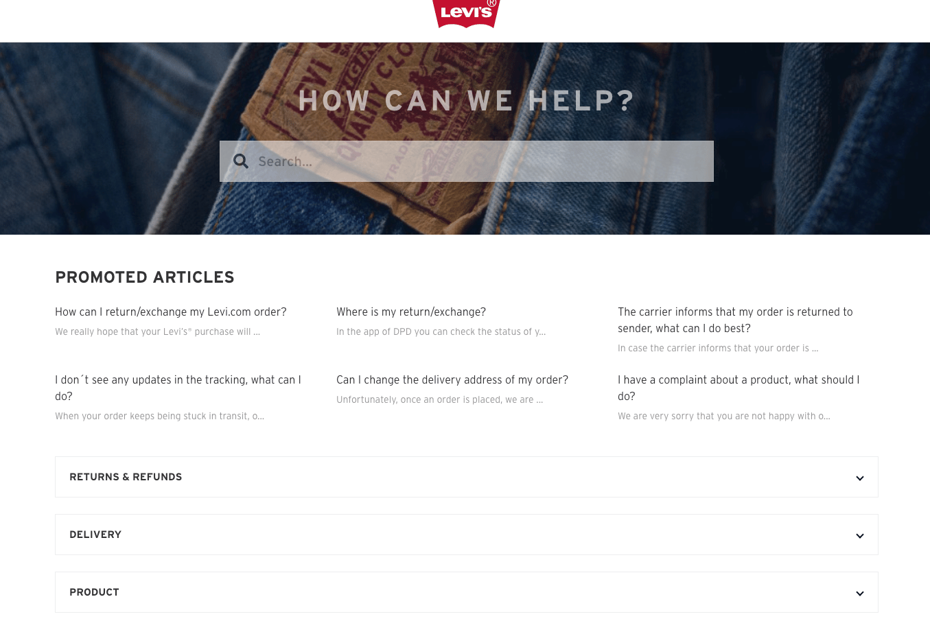
Levi's is an American clothing brand known for its denim jeans.
It has stores across the world and has an e-commerce store that ships worldwide.
It has a help center split into categories.
The categories are product care, returns and refunds, delivery, product, orders, payment, promos, etc.
Within the category, there are multiple questions that relate to the category.
Levi’s adds a yellow star next to the most popular questions. This helps users quickly identify the information they might be looking for, saving them time and effort. The less time and effort a user needs to spend searching for the answer, the more satisfied they’ll be with the brand.
When a user clicks on a question, it opens an article with the answer.
If the answer the user was looking for isn’t provided, they can use the Submit a Request button or click Contact Us in the footer of the page.
23. Gap UK
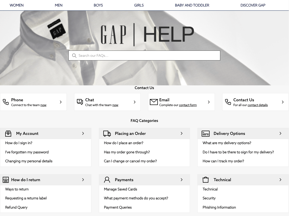
Gap is an American clothing store that sells both on its e-commerce store and in physical stores.
The FAQs are accessed through the help center. The help center includes contact information, a search bar, and questions organized into categories.
The most popular questions are underneath the categories, making it easy for customers to find the information they want. When a user clicks on a question, it opens an article with all of the details.
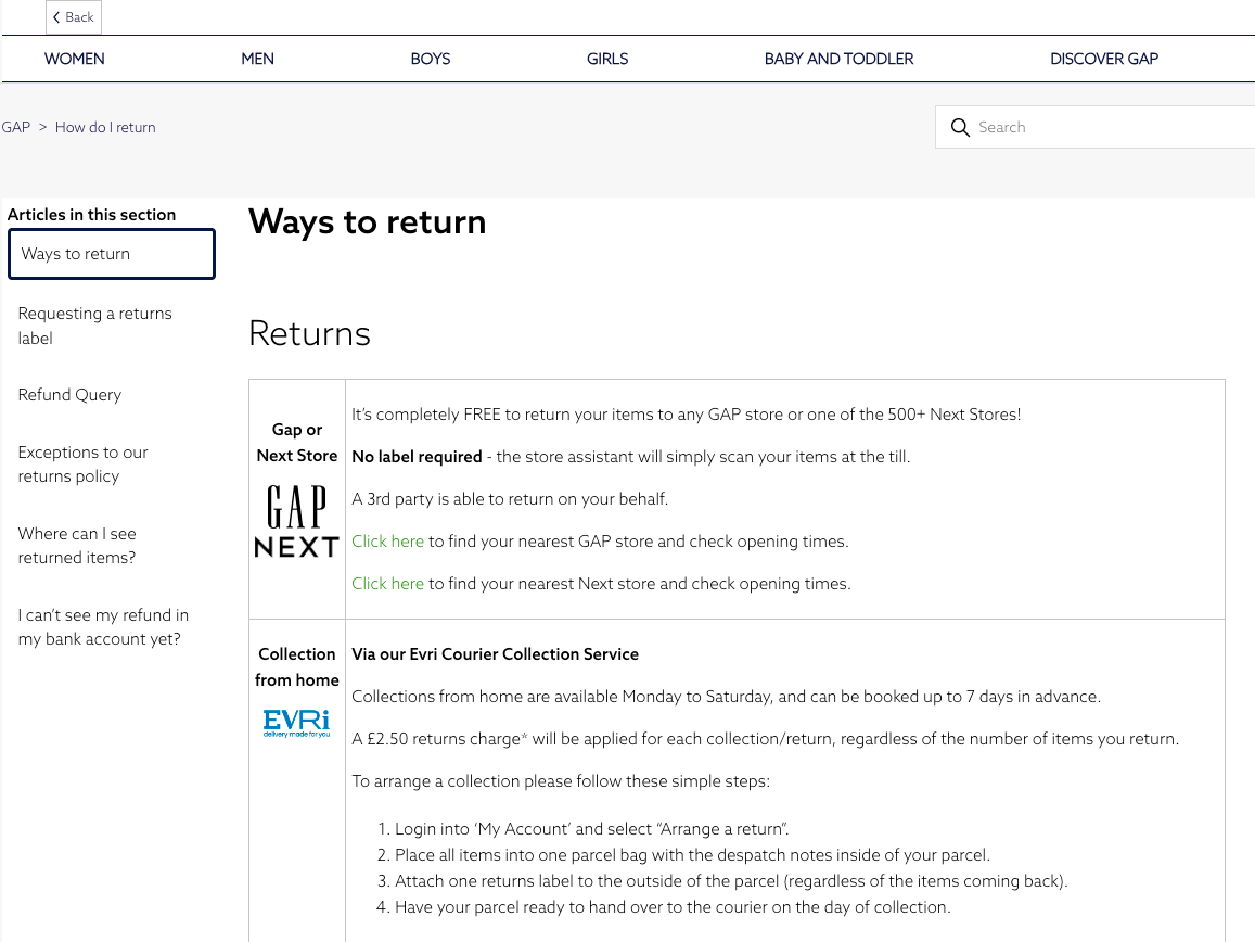
Gap’s help center is run through Zendesk (like New Balance’s). Zendesk is a customer service solution.
The way Gap uses Zendesk is more cohesive and seamless than New Balance. All of the help information on Gap is accessed through Zendesk (https://gapuk.zendesk.com/hc/en-gb); this includes the return information and contact details.
In comparison (as we saw earlier), New Balance has contact and FAQ information on both its website and Zendesk, which is confusing for customers.
24. Tommy Hilfiger
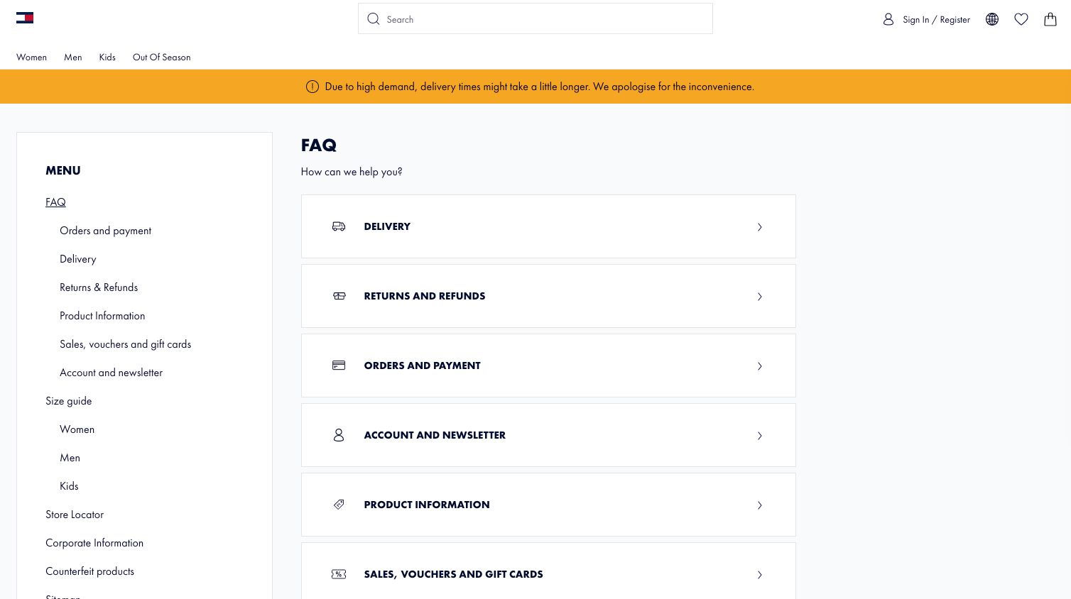
Tommy Hilfiger is an American brand that sells women's, men's, and kid’s clothes and accessories.
The FAQ center is clear and easy to navigate. It also uses the same fonts and colors as the rest of the website, so it blends in seamlessly.
There is a menu on the left-hand side of the FAQ section with categories. Each category includes several questions, and when the arrow next to the question is clicked, it displays the answer in a dropdown box.
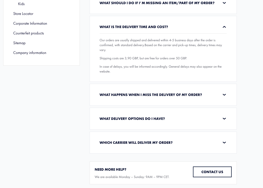
There is contact information available underneath the questions. Users need to scroll past the questions to access the contact information.
This strategic placement can help reduce the number of users who contact the team with questions that are answered on the website, as they should see the answers before the contact button, which will likely save the brand time and resources.
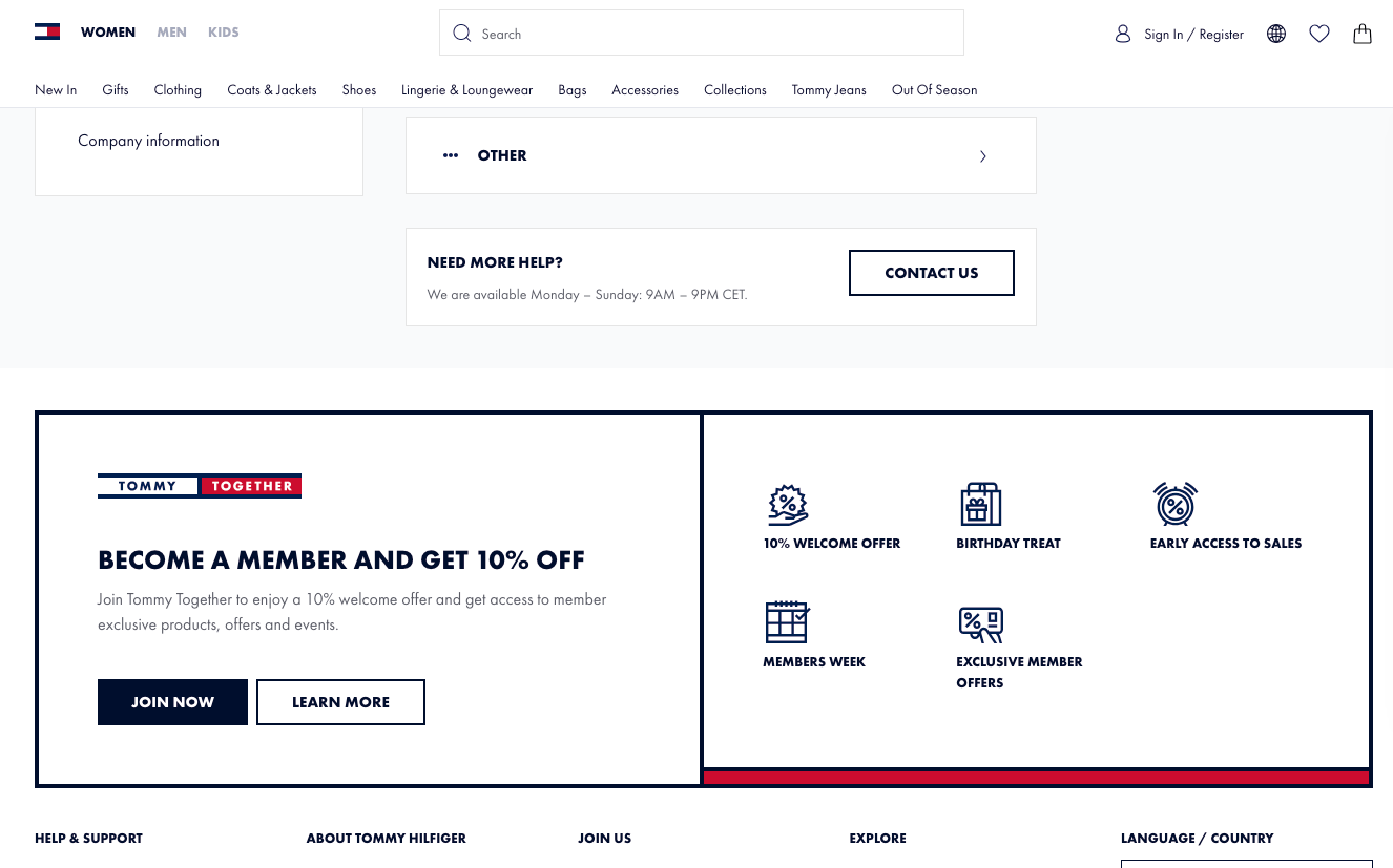
At the bottom of the website and FAQ page, there is a promotion to become a member of Tommy Together. Adding the promotion at the bottom of the FAQ page means customers are likely to see it once they’ve found an answer to their question, so it’s a natural way to encourage them back to the website and to spend.
25. Abercrombie and Fitch
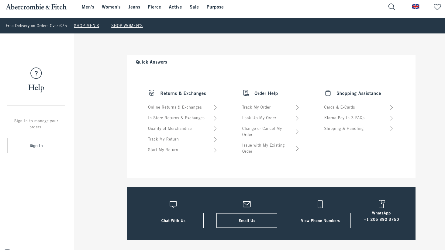
Abercombie and Fitch is a casual clothing brand aimed at teens and young adults.
Its help center is easy to navigate, with three columns of questions.
The columns separate the questions into different topics. The first is for returns, the second for orders, and the third for shopping assistance. The user can click on the questions, and it will take them to an article with all the details.
Underneath the questions, there is a contact section.
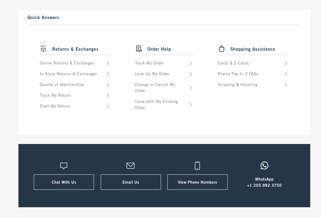
One of the ways to contact the Abercrombie and Fitch team is through WhatsApp.
WhatsApp is popular for many age groups, but young adults make up a huge number of users in the US, with 46% of users being aged between 15 and 35 [1]. Providing a contact option that aligns with their demographic improves the customer's experience.
What Is an FAQ Page for an E-Commerce Store?
FAQ stands for frequently asked questions.
An FAQ page for an e-commerce store is a page that answers customers and potential customers frequently asked questions. It should serve customers at all phases of their buying journey.
The page keeps all the information organized and in one place, so it’s easy for customers to find and navigate.
It is almost like a manual to your store that customers and potential customers can visit themselves. They can find what they need without having to contact the store for information.
Usually, stores add questions about shipping, returns, delivery, and product information. The questions added will depend on the store and the products it sells.
FAQ pages are often linked with a help center or customer care service on the website.
Why Should I Add an FAQ Page?
An FAQ page makes it quick and easy for customers to find out the answers to any questions they might have.
This also has some other benefits, including increasing your conversions and keeping costs low.
Let’s look at the benefits in more depth.
Increase Customer Satisfaction
A FAQ section is always available for customers. It is like having 24/7 on-hand support.
Customers can find all the information they need instantly, at any time, in one place.
This shows that you care about your customers and potential customers, which can increase their experience with your brand.
Save Time and Keep Costs Low
An FAQ page should answer all of the common questions that users contact you with.
Therefore, fewer users will reach out to you or your customer service team. This will save your company time and reduce your expenditures, as you don’t need to employ as many customer service staff.
Increased Conversions
The more information you provide to your customers in your FAQs, the more comfortable they will be purchasing your products.
You can create questions with answers that share information you want the customer to know (e.g., the product's benefits).
It’s a great way to show off your products and knowledge without using a sales pitch. It can help increase the customer's excitement and likelihood of purchasing your products.
The FAQs also share important information about returns, warranties, and refunds. The security of a product warranty or exchange option makes them feel secure in their purchase, which can increase your sales.
Build Brand Reputation and Credibility
Users are coming to your FAQ page to find answers.
They are interested in your brand and want to find out more.
Providing clear and honest answers shows that you have knowledge of the products, are an authority in the niche, and operate professionally.
This can help build relationships with your users and increase your brand’s credibility.
Increase Reach
You can use your FAQs to share information about the products and industry rather than only questions that are specific to your brand or company.
Providing these answers can increase the number of organic users visiting your site.
For example, let’s say you run a store selling hair oil. Someone might search ‘How Can Hair Oil Help My Hair?’ If you’ve got this as a FAQ, Google might present your answer to the searcher.
This searcher might not have known about your brand but has ended up on your site for the answer, which increases your brand recognition and can help generate sales.
Tips for Writing an FAQ Page
An FAQ page is crucial to your e-commerce store, and it can do a lot more than answer your customer's queries.
It can help you generate sales, increase trust with your customers, and build your brand identity.
Here are a few tips to help you do that.
Add a Contact Us Button
Your website visitors will go to your FAQ page to find the answers to their questions.
But, if the question they have isn’t listed in your FAQ, or they need more information, they will want to contact you.
Adding a contact button that’s accessible from your FAQ page makes it easy for users to do this.
So, add a link to your contact information on your FAQ page, and if you have any additional help pages, add them here.
Align the FAQ Page with Your Brand
Your FAQ page should match your website and brand personality.
This should include the way your FAQ page looks. This is done using your format, layout, colors, and fonts.
We also recommend that you choose a tone of voice for your questions and answers that match your brand.
Keep the FAQs up to Date
If you make any changes to your business or release new products, make sure to keep your FAQs up to date.
This will ensure your customers have the most accurate information, which will improve their experience with your brand.
We also recommend that if your customers keep contacting you with the same questions, you add these to your FAQs. It’ll save you time and energy and help your customers.
Group the Questions by Topic or Category
Organizing your FAQs into categories can help your users find the questions they’re looking for.
If your content is difficult to find, it can be frustrating for customers, and they will end up contacting you or finding another brand.
Add a Search Bar
A search bar allows customers to search through your FAQs by keyword.
Like grouping the questions into categories, adding a search bar makes the questions and answers easy to find and move between.
Highlight or Add Your Most Popular Questions at the Top
You can add a section at the top of your FAQs with your most viewed questions. You can also highlight your most popular questions within the categories.
The likelihood is that most users will be looking at your FAQs for the same questions and answers.
Highlighting popular ones makes it quick and easy for users to see the answers.
Add Links to Products, Related Questions, or Other Pages
You can add links to your answers that help your customers. This makes it easy for users to navigate to other areas of your site.
This can improve your customer's experience, as it can provide an expanded answer to the question or direct a user to a helpful page.
Internal link building also helps Google understand and find out what your pages are, which can boost your page’s authority. It’s a great way to increase your rank on Google, increasing your discoverability.
Use Videos and Images
Depending on your product and question types, images and videos can be powerful in your FAQs.
They are incredibly engaging and can do a better job of explaining the answer to the question than text.
If your images or videos feature you or your team, they also allow users to get to know your brand on a personal level, which can increase trust.
Use Short, Clear, and Simple Answers
Your answers should be short and easy for customers to understand. They should answer your customer questions as soon as possible, ideally in the first line.
We don’t recommend using any language that’s overly technical. Users who don’t know anything about your products are likely to visit your FAQs, and technical language can alienate them.
Answer your questions as if you’re speaking to someone with no experience or knowledge of the brand or products.
What Should Be Included in an Online Store FAQ?
If you’re stuck with what to add to your store’s FAQ page, we’ve created a list of questions we add to our stores.
You can copy and paste the questions to your own store and write your own answers.
You might want to adjust the way the questions are written slightly so they align with your brand.
Delivery
The delivery questions and answers are related to the shipping and delivery process.
Customers will want to know how long it takes for orders to arrive, so you could link to tracking software and advise them how to find their order number.
Delivery questions and answers also set the customer's expectations, which can help reduce the number of complaints or questions about late or missed delivery.
Delivery Example Questions
- Where is my order?
- Who delivers my order?
- How long do orders take to arrive?
- Do you offer express shipping?
- Can I ship my order to a non-residential address?
- Can I ship my order to an address different from the billing address?
- Why has my order been returned and not delivered?
- How much does delivery cost?
- I missed my delivery, what can I do?
Returns
Informing customers of your return and refund policy can increase the number of orders that are placed.
Customers will often feel like they can spend more if they know that they can send the product back for a refund.
Returns Example Questions
- What is the return policy?
- How do I return the product?
- Can someone collect my return?
- How do I get a refund?
- How long do refunds take?
- I’ve lost the return slips. What can I do?
- How long do I have to return an item?
- Do you offer exchanges?
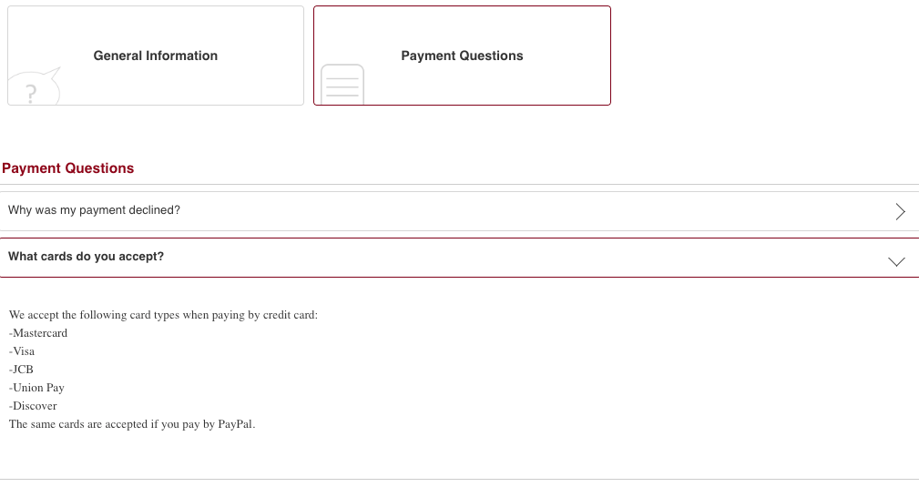
Order and Payment Problems
This category should address any problems that might occur when a customer is trying to place an order or when they receive their order.
Order and Payment Problem Example Questions
- My item is broken. What can I do?
- I received an incorrect item. What can I do?
- The product is faulty. What can I do?
- There is an item missing from my order. What can I do?
- Can I change the delivery address for my order?
- Can I change my order?
- Can I cancel my order?
- What is my order number?
- Why was my order declined or canceled?
Product and Brand Details
Product and brand details will help customers understand your product better and work out if it’s right for them.
You can use persuasive language to convince your customers to buy from you. But your answers should be honest and clear.
This section will vary depending on the products you sell. For this section, we’ve included some common ones we’ve used. These can be adjusted for your brand and product types.
Product Example Questions
- Do you have a sizing guide?
- How do I clean the products?
- How do I wash the products?
- How do I use the products?
- Are the products vegan?
- Is the brand sustainable?
- What is the product warranty?
- When will the product be back in stock?
- What are the products made of/ingredients?
- How does the product work?
- Is the product right for me?
- Which product should I choose?
- How often should I use the product?
Frequently Asked Questions
How Do I Write a FAQ for My E-commerce Website?
Think about the most commonly asked questions by customers and potential customers and answer them as clearly, positively, and simply as possible.
The most common question types include product details, delivery, shipping, returns, refunds, and canceling orders.
How Do I Write a FAQ on Shopify?
You can create your own Shopify page and add your FAQs or use a free app like HelpCenter to build your FAQ page. You can download HelpCenter from the Shopify app store.
If you need a more advanced support service, consider a customer service solution like Zendesk and integrate it with your Shopify store.
Final Thoughts
Hopefully, the FAQ page examples have given you some ideas for your own store FAQ page.
If you want more examples from winning Shopify stores, check out Dropship’s Top Stores using the 7-day free trial.
Top Stores shows the top performing Shopify stores and updates every 24 hours. You can open these winning stores and look at their FAQ pages for inspiration.