Ecommerce Ads Examples to Create Better Ads
This guide will display a lot of ecommerce ad examples to help you create better ads. Read on to learn more.
I’ve created a lot of ads for dropshipping stores in the past. And I’ve seen a lot of bad ads that other stores have made. I want to prevent you from creating those bad ads.
Let’s check out some ads.
Key Takeaways
- High-quality visuals and clear messaging are essential for effective ads.
- Focus on solving customer pain points to make your ads compelling.
- Utilize social proof (testimonials, reviews) to build trust with potential customers.
- Experiment with different ad formats and A/B testing to optimize results.
1. Facebook Ad Examples
The following sections will provide examples of Facebook ads in these categories:
- Carousel: Best for showcasing multiple products.
- Video: Best for showing the product in use.
- Photo: Best for single products.
I’ll show the ad, explain what it did well, where it could improve (if applicable), and provide additional commentary to help you develop similar ads.
By the way, I used Dropship’s Ad Spot tools to find these ads. Try it for free to find example ads. And when you find a good ad, you’ll need to know how to save it.
Let’s start with carousel ads.
1. Facebook Carousel Ad Examples
I’ll explain what these ads did well, where they could have improved, and provide additional information if needed.
1. Spark Paws
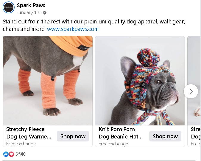
I sifted through thousands of carousel ads (nearly went insane) and chose one about dog clothing. Why?
It does a great job presenting its products.
There’s no busy background. All images are high-quality and have adorable models that show the clothing in use. Thus, it helps potential customers understand whether the clothing will fit their companion.
And they have simple, concise ad copy. If you want your dog to stand out, they’re targeting your pain point. Then they mention other types of dog gear sold.
The only complaint I have is the URL insert. It looks a bit unprofessional, but it won’t kill an ad.
2. The Baklava Box
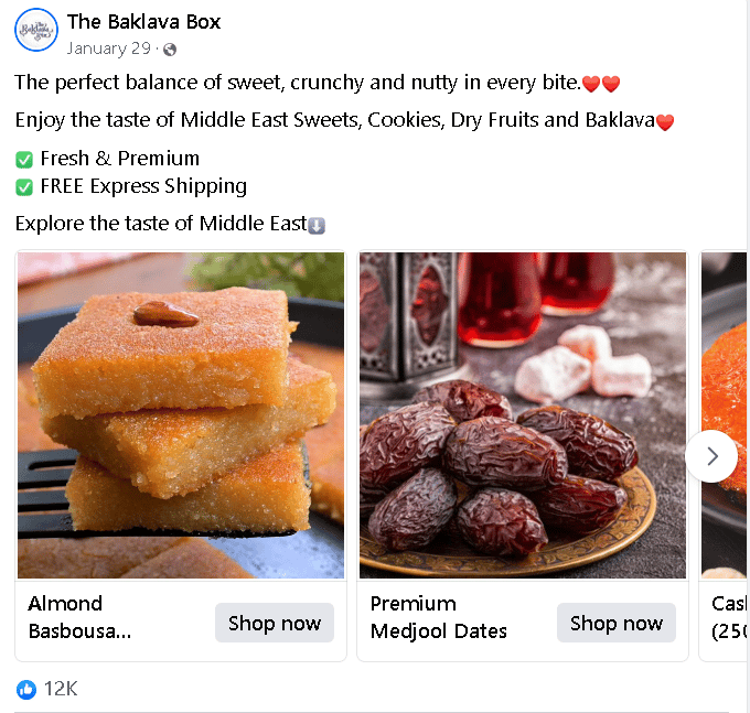
I love eating baklava as much as I love The Baklava Box’s ad copy. However, they love their ad a bit too much with all the heart emojis. That’s the biggest complaint I have about this ad.
Otherwise, their sentences are concise. They use lists. Their use of green checkbox emojis helps the lists pop. And they explain what types of foods they have. Though, the second sentence is missing punctuation.
Is this an “optimal” carousel ad? Almost. Learn from their mistakes and make your ads optimal.
2. Facebook Video Ad Examples
The following sections will go over what companies did right with their Facebook video ads, how they performed, and whether there are any improvements necessary.
Let’s dive in.
1. The Ridge
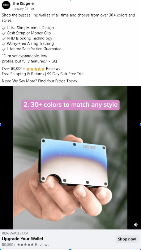
Here’s why I love Ridge Wallet’s ad:
- Social proofing: They have a quote from GQ; which improves trust.
- Concise CTA: “Upgrade Your Wallet” is short and direct.
- Use case demonstration: It shows you could lose your wallet and find it later with the Airtag tracking.
- Features: Not necessary, but they list the features briefly, which can help.
- Bulleted points in ad copy: Answers questions for weary customers.
What could they have improved upon? The part with a table saw ravaging a wallet wasn’t necessary. When I first saw the ad, I thought they were going to showcase that the Ridge Wallet could withstand a table saw.
That wasn’t the case.
The ad had decent reactions—more than 1,200 likes and reactions. This ad also performed MUCH better than the other ads they used, which had around 200 reactions.
2. Gardyn

Gardyn is a complex hydroponics tower that employs automation to track your plants. “Complex” is the key word. If this were an image, I’d find myself upset that I have to navigate to their website to learn how it works.
The video does a great job presenting the product, explaining various features, tackling pain points, and illustrating its uses without filler.
As a home gardening enthusiast, I would have liked to see them explain what plants you can grow with this. However, you’d need to visit their website to see.
Otherwise, my biggest complaint is with the CTA. It’s too long. I would have gone with “Try Gardyn for 60 Days.”
You're welcome for the audit, Gardyn. I accept payments through PayPal.
3. Facebook Photo Ad Examples
I’ll provide a couple examples of Facebook photo ads and explain why they do well. If applicable, I will also explain in areas they could have improved.
1. Everyday Dose
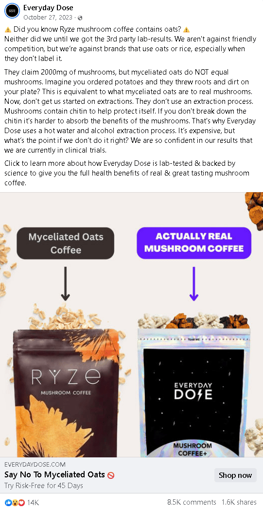
I’m not the demographic for this product and almost had a panic attack trying to read that wall of text, but this ad’s thorough for skeptical buyers. It’s a bit of an attack ad, but they do a great job breaking down their competition.
I’m not a mushroom enthusiast and can’t say whether this is marketing BS. However, I can tell you that they could have broken down the information into a list format. Or turn this ad into a collection where each point illustrates the downsides of myceliated oats.
However, they made an impact on their community (in a good way). More than 14 thousand reactions and 1.6 shares aren’t bad for a Facebook ad. And Everyday Dose interacted with many of the comments on this ad.
Doing this fortifies a sense of community.
Their CTA is also on-point. It’s concise and actionable.
2. MUD/WTR
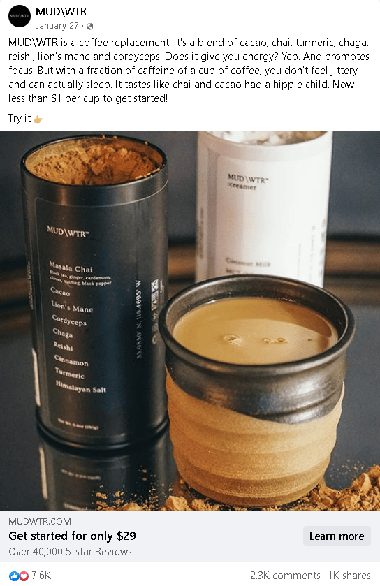
I’ve never been a fan of “muddy water,” but can imagine why this ad did well. It targets a pain point, a coffee replacement. Then explains why customers should choose their caffeinated drink over coffee.
Like Everyday Dose, they do a good job with interacting with their audience in the comments (community building) and have a concise CTA.
The problem, again, stems from information presentation.
I’ll need this drink to focus reading that wall of text that’s their ad copy. Anyway. Space out text when possible to create more negative space.
Like this.
Or present information in lists like what Ridge Wallet did. Here’s an example:
- Jitter-free
- $1 per cup
- Promotes focus
- Blend of cacao, chai, turmeric, chaga, reishi, lion's mane and cordycepssome text
- Comment: I’d shorten this since all the ingredients are in the image.
Then from there, I’d have a single-sentence paragraph with their chai and hippie joke. Then a 2-word paragraph for “Try it.”
Let’s move onto Google ad examples.
2. Google Ad Examples
I’ll cover the following Google ad example formats:
- Text ad: Best for capturing users searching for specific products by appearing at the top of relevant searches.
- Display ad: Best for targeting users based on topics, websites, or keywords they interact with (e.g., running shoe company ad on a running blog).
- Shopping ad: Best for businesses selling physical products with high visual appeal.
I’ll explain what ad examples in each listed format did right and how you can implement it into your ad development strategy. If there are areas they could have improved on, I’ll let you know.
1. Google Text Ad Examples
Google text ads appear at the top of search engine results pages (SERPs) when users search for specific keywords related to your product or service. For instance, if you type “Freelancer,” you may see an ad for Freelancer.com.
There isn’t much complexity when it comes to text ads. Thus, I’ll provide a single example:
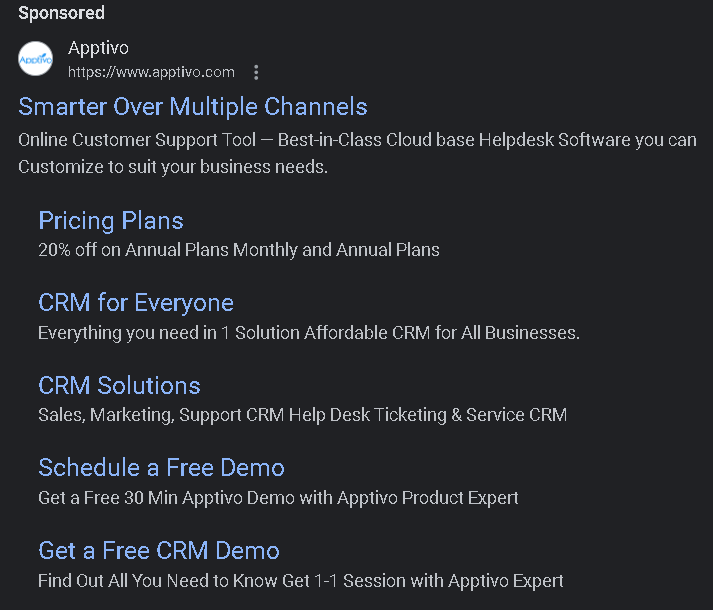
Why it works:
- Clear value proposition:Clearly states what the product is and who it’s for.
- Strong call to action (CTA): Tells the user to “Get a Free CRM Demo.”
- Keyword relevance: Ideal for if you’re already searching for the product, because a sponsored competitor post also appears.
- Conciseness and impact: Provides a lot of information with a small character limit.
Of course this ad isn’t perfect. They could have gotten rid of sitelinks: “CRM for Everyone” and “Get a Free CRM Demo.” CRM Solutions does a better job at explaining the particular solutions. And Schedule a Free Demo specifies the demo’s duration.
The addition of these sitelinks creates visual clutter that could overwhelm the customer and prevent them from taking action.
2. Google Display Ad Examples
Google Display Ads appear on websites, apps, and YouTube videos you browse, reaching a broad audience beyond search engines. They're ideal for businesses promoting brand awareness or specific products to a wider online audience.
I’ll explain why they work and whether there are areas they can improve upon.
1. Grammarly

Why it works:
- Social proofing: Explaining such a large number of users implies that 30 million users trust it.
- The use of “free”: Skeptical customers know they can try the software for free; worst case scenario, they don’t like it and could abandon it whenever.
- Clear CTA: Tells you to try it for free. No dilly-dallying.
The biggest areas for improvement that I see with this ad are the use of visuals and the lack of an explanation of whether I need a credit card to use it. Many folks are skeptical of “free” products because trials often require you to enter your credit card information.
Grammarly doesn’t require cards for their free version. But it would help the sell to include something like, “Try it free today (no credit card required).”
The visual also doesn’t make sense. They could have shown a GIF (short video on loop) of their software correcting a common grammatical error. Or a screenshot of their software suggesting a correction.
2. SEMrush

Millions of websites have shown this ad as an example, but for good reason. The bright red button will grab most readers’ attention and possibly intrigue them with the free trial. However, this ad’s only valuable for someone who knows what SEMrush is (e.g., SEO writers).
Otherwise, SEMrush does a great job at having minimal visual clutter and impactful colors. They tell you how long the trial is worth and how much you save to make you feel like a financial genius.
3. Google Shopping Ad Examples
Google Shopping Ads showcase product images, prices, and store names directly in search results. They work by pulling product information from your Merchant Center account.
Shopping Ads are ideal for driving product discovery and online sales.
I’ll provide a single example of what appeared when typing “mountain bicycles” into Google:
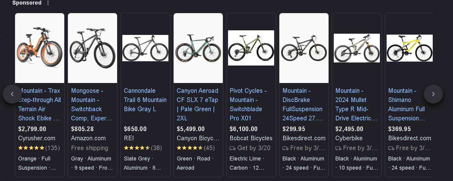
Cryusher did the best job out of all the ads in this list. They have the best angle for their product, which allows us to see the bike from various angles. It doesn’t look awful for dark mode browsers (like myself) since they fill the entire image background with white.
And it shows the reviews (which aren’t bad). Thus, it helps build trust with customers. Though it’s more than double the price of the Amazon bike, I’d trust Cryusher’s more.
3. Amazon Display Ad Example
Amazon Display Ads appear on websites and apps across the internet that are part of the Amazon Publisher Network. These ads function similarly to Google Display Ads. They use targeting options to reach users based on browsing habits, demographics, or interests.
Here’s when you should use them:
- Retargeting: Reconnect with users who have previously interacted with your product listings or brand on Amazon.
- Brand awareness: Increase brand visibility for new product launches or reach new audiences within relevant product categories.
- Drive sales: Promote specific products with enticing visuals and link directly to your Amazon product page for easy purchase.
Amazon Display Ads extend your reach beyond Amazon's platform, allowing you to target potential customers who might be earlier in the buying journey and browsing elsewhere online.
There’s not much to cover here. Let’s stick to a single ad:
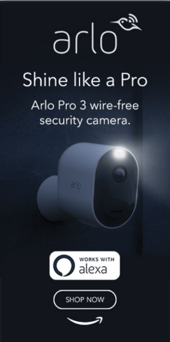
Why it works:
- Concise CTA: Tells the user to shop now; nothing else is needed
- Summarizes what it is: It explains that it’s a wireless security camera without presenting a wall of text.
- Simple, yet effective graphics: The camera pops in the dark room due to its light, which helps illustrate that this camera won’t have issues recording in the dark.
- Alexa-compatible: Great for selling to folks integrated in Amazon’s ecosystem.
There’s not much to talk about with this ad. It shows the product, explains what it is, and presents a call to action. As all ads should.
There are plenty more platforms that I didn’t provide ad examples from. But what I listed should help you get started.
Still need help? Keep reading and I’ll explain what makes for an excellent ecommerce ad.
What Goes Into a Good Ecommerce Ad?
Here are good tips to follow when creating an ecommerce ad:
- Leverage social proof: Use testimonials, reviews, or user-generated content to build trust.
- Create a sense of urgency: Utilize limited-time offers or scarcity tactics to drive immediate action.
- Focus on emotion: Tap into powerful emotions to connect with viewers on a deeper level.
- Utilize eye-catching design: Employ bold colors and clear typography for maximum impact.
- Optimize for mobile: Prioritize design and functionality for the surging mobile audience.
- Emphasize pain points: Address customer pain points directly within your ad copy.
- Personalization: Use dynamic retargeting to show relevant products to users based on past behavior.
Yes, this is vague information. However, it’s a starting point to bounce off of when creating your ads. These sections will explain a bit deeper of how you should prepare for your ad development.
1. Audience Targeting
Dig deep. Don't rely on assumptions. Research your target audience's demographics, interests, online behavior, and pain points. From there, create a buyer persona.
This buyer persona will become the foundation for your entire ad strategy.
If you’re having trouble figuring out your demographic, use platform insights. Most advertising platforms offer audience building tools like Facebook Ads Audience Insights. Utilize these to create custom audiences based on demographics, interests, and behaviors relevant to your ideal customer.
Now that you have a buyer persona, tailor your message. Don't try to reach everyone with the same message. Segment your audience into smaller groups with similar characteristics. This allows you to create targeted ads that resonate more deeply with each segment.
Summary: Thorough audience research, including demographics and pain points, builds a buyer persona that is essential for ad success. Segment your audience and tailor ads to each group for a deeper impact.
2. Compelling Offer & Messaging
Why you? In a crowded online marketplace, your unique selling points (USPs) are critical. Highlight what makes your product or service better than the competition. What value do you offer that others don't?
Focus on solutions, not features. Don't just list product features. Explain how your product solves problems your target audience faces. Use clear and concise language that speaks directly to their needs and desires.
Finally, tell them what to do next. Don't leave your audience guessing about the next step. Include a strong call to action (CTA) in your ad copy. Whether it's "Shop Now," "Learn More," or "Download Now," make it clear what action you want users to take.
Summary: Show your customer why they should choose your product over the competitions’. Meanwhile, ensure you have a strong call to action.
3. Creative Assets
Now you’ll need to select an ad type. Choose a format that best suits your product type. High-quality visuals are essential for fashion or homeware. Meanwhile, explainer videos are more effective for complex software (e.g., Grammarly).
Now that you have an ad format, ensure your visuals don’t suck.
Craft visuals that resonate with your audience. For established brands, high-quality, polished visuals might be the way to go. But for local businesses, a more down-to-earth approach also works well—think family-owned or independent local businesses.
It’s time to present your product to the world. Run A/B tests with different visuals, messaging variations, and CTAs to identify the top performers that resonate most effectively with your target audience.
Here are examples of how I’d perform an A/B test:
Targeting an older demographic:
- Test A: Large font, high-contrast visuals for better readability
- Test B: Formal messaging versus conversational, friendly tone
Targeting budget-conscious shoppers:
- Test A: Emphasize price and discounts in the headline.
- Test B: Highlight value for money and long-term savings.
When deploying A/B tests, ask yourself, “What do you want to learn about your audience?” Let’s use the old people demographic as an example. I’d want to know whether they’re more likely to engage with images that feature people of their own age group or younger models.
Summary: Select an ad format suited to your product (images for fashion, videos for software). Prioritize high-quality visuals, but tailor the style to your audience.
What Is Ecommerce Advertising?
Ecommerce advertising is the use of paid online channels to promote products and services to potential customers. It aims to drive awareness, interest, and sales for online stores or service providers.
Typical platforms that’ll allow you to place ecommerce ads include:
- Search engines (Google, Bing, etc.): Ads appear alongside organic search results, triggered by relevant keywords.
- Social media (Facebook, Instagram, TikTok, etc.): Ads blend into newsfeeds, targeting users based on interests, demographics, and behaviors.
- Websites (Blogs, news sites, etc.): Ads displayed as banners, sidebars, or within content.
- Marketplaces (Amazon, Etsy, etc.): Sponsored listings and product promotions within the marketplace environment.
To get started with these platforms, a marketing team should first identify target audience and campaign goals. From there, research platform specifics—understand ad formats, targeting options, and budget requirements.
What are examples of different ad formats?
I thought you’d never ask:
- Display ads: Static images or banners of varying sizes.
- Video ads: Short, engaging videos promoting products or brand stories.
- Shopping ads: Product-focused listings with image, price, and merchant information.
- Carousel ads: Multiple images or videos users can swipe through.
- Dynamic ads: Personalized ads tailored to a user's browsing history.
Figure out what ad format will give you the most return on investment. For instance, video ads are fantastic for demonstrating product use, telling a brand story, or creating an emotional investment.
Surveys suggest that 73% of all consumers are more likely to buy a product after watching a video explaining its use [1].
Don’t blindly incorporate specific ad tactics into your marketing. As demographics and reactions will vary. A/B test ad formats for your product and audience.
Otherwise, thanks for reading.
Summary: Ecommerce advertising offers targeted reach and measurable results for success in a booming market. Adjust budgets and campaigns as needed to outperform the competition.
Conclusion
Creating successful ecommerce ads takes research, creativity, and testing. Start by understanding your audience, crafting a compelling message, and testing different ad formats.
You might need a tool that’ll allow you to scan tens of thousands of Facebook posts and see whether they work. Learn how Dropship can help.