

8 Best Free Shopify Themes for Dropshipping Stores
Compare eight free Shopify themes by their Dawn or Horizon architecture and use the Engine-First Theme Check to match one to your catalog.
Shopify's best free themes come from Dawn and Horizon. Start with the family that gives you enough editing freedom. Then choose a design within it.
I've built two Shopify stores with free themes. The first time, I scrolled until one looked right. The shortcut eventually cost me a rebuild.
This guide will help you avoid the same mistake. You'll choose a free theme that still fits after launch.
Key takeaways
What are the best free Shopify themes?
Shopify's strongest free options use the Dawn editing model or the newer Horizon collection. Horizon has 10 free themes built on one system, while Dawn is the older base behind most other free designs. Pick the editing model first, then compare colors, fonts, and demo photos.
A Shopify theme controls how your store looks. Its family controls how you arrange sections and blocks, while the preset provides the starting design.
Shopify's current theme collection changes over time. This article ranks eight useful free options without treating the current list as permanent.
Either family can work if you'll leave the demo layout mostly untouched. Choose the closest match for your products. Then move on.
How Shopify's free themes actually work
A theme's editing model controls how you arrange its sections and blocks. This guide calls that model the theme's "engine." Themes in one family share the same basic editor structure.
Dawn keeps local blocks inside their sections, while Horizon lets reusable theme blocks nest.
Blocks can sit inside other blocks. This nesting creates a deeper page hierarchy without a new section for every layout.
Shopify launched Horizon on May 21, 2025. The company said the collection was built with theme blocks, giving merchants a second editing model.
Changing families later means setting up the page layouts again.
Dawn suits a workflow built around older tutorials and community answers. Horizon suits merchants who can work from its current editor and documentation.
Summary: Choose Dawn for familiarity and Horizon when nested layouts matter more than older tutorials.
The 8 best free Shopify themes for dropshipping
I ranked these eight themes by editing model, catalog fit, navigation, product-detail tools, image demands, mobile buying path, support maturity, and material drawback. Each entry applies those shared criteria to a different store.
Use this list to jump to the right starting point,
- Dawn: The safest baseline for a first store.
- Horizon: The flexible pick for changing layouts.
- Refresh: The Dawn design for category-led catalogs.
- Sense: The detail-heavy option for small catalogs.
- Taste: The image-led choice for styled products.
- Studio: The specialist design for art and prints.
- Spotlight: The fastest route to a simple storefront.
- Ritual: A bold Horizon start for fashion stores.
Start with the option that matches your catalog, then use its test to check the fit.
1. Dawn

Pick Dawn as a reliable free start for a first dropshipping store with a moderate catalog. Shopify develops the theme and lists it as free. Its current feature set includes filtering, swatches, quick buy, product options, and a mega menu.
Dawn supplies the baseline for the older editing model. Its neutral layout keeps the focus on your photos, and our earlier review preferred its product filter to the free options tested then.
A medium catalog gets the most from that balance. Shoppers can browse by color and product type without facing one enormous page, while mobile buyers get quick buy and fixed navigation.
Make Dawn the control in your shortlist. Load the same three products into each candidate, then test the home, collection, and product pages. Pass the theme only when navigation, variant selection, and checkout work with those products.
A specialized preset should beat Dawn at a specific job, such as product education or visual merchandising. Choose Dawn when no preset performs that job better.
Dawn struggles with nested content. Its settings cover plenty of layouts. Deeper page designs may still need code. Choose Horizon if more freedom matters more than Dawn's long support history.
2. Horizon
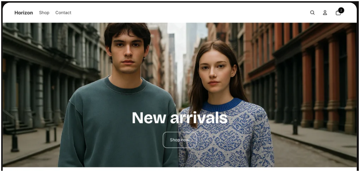
Horizon is the namesake preset in Shopify's Horizon collection and suits stores that will rebuild page layouts as they grow. Shopify lists it as free. The listing credits nested theme blocks for its flexibility.
Horizon supports different page layouts through nested content and flexible ordering. Its listing also includes quick view, infinite scroll, filters, swatches, and a slide-out cart.
Its layout control is why Horizon makes this list. The plain preset works for clothing, accessories, and general goods. Choose Dawn instead when your workflow depends on an established tutorial for each change.
Before you pick Horizon, draw the page that's hardest to build. List every planned image, offer, comparison, testimonial, and app block.
Now copy that order in the editor.
The extra flexibility earns its learning curve when the editor reproduces that order without custom code and every required app block works. Simple pages get little value from nested blocks.
I've assessed Horizon from Shopify's current docs and demo for this refresh. I haven't installed or benchmarked it, so preview every required app inside your own store.
3. Refresh
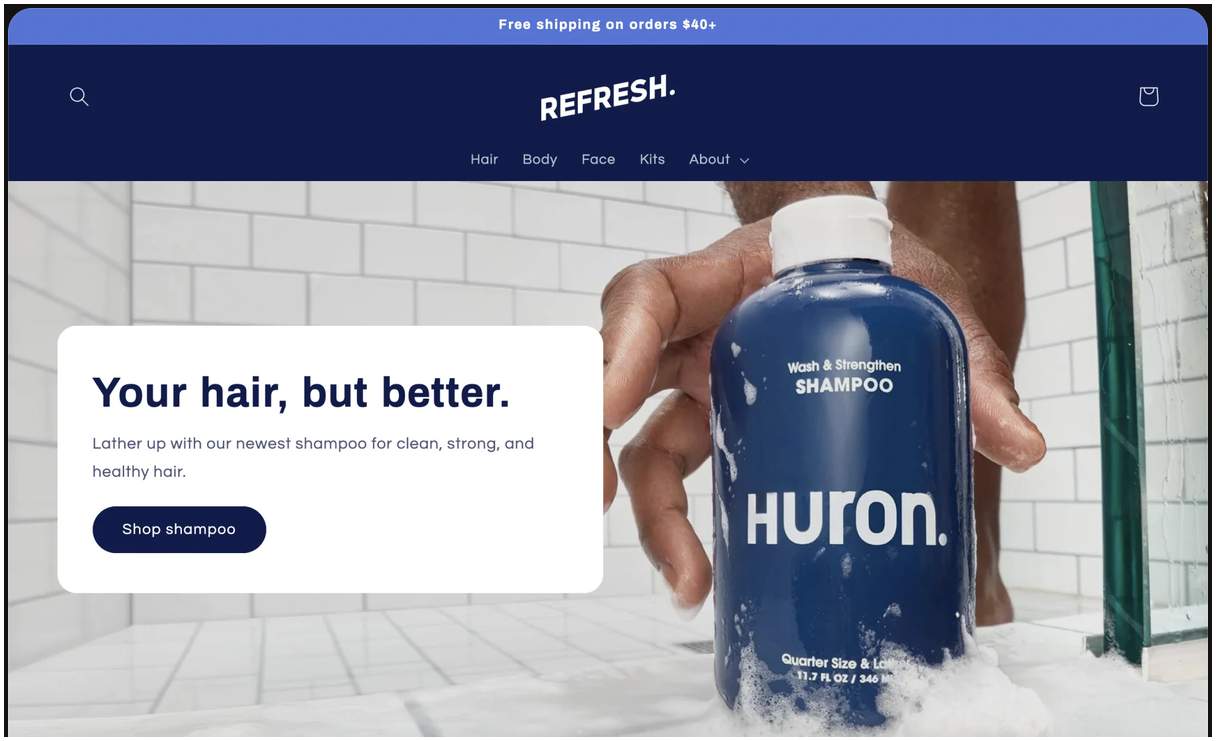
I pick Refresh from the Dawn family when product and category pages matter most. Its listing focuses on product detail sections that adapt to your catalog. You can add testimonials and facts about each ingredient. Filters, swatches, and a mega menu help organize the wider store.
Those tools help shoppers filter imported products and move between related collections. The earlier review favored Refresh for its easy-to-change product and category pages. That approach still suits beauty, hair care, supplements, and other products that need proof near the offer.
Refresh best fits a medium catalog with a few related collections. Choose Sense for one product and stronger navigation for a huge catalog. Quick buy and a slide-out cart cover the main mobile path between those extremes.
For a fair test, use the product in your feed that needs the most explanation. Fill each detail section with real ingredients, materials, directions, or proof.
In the mobile preview, confirm that those details and the purchase controls remain easy to find.
Refresh shares Dawn's section model and changes only the starting design.
4. Sense
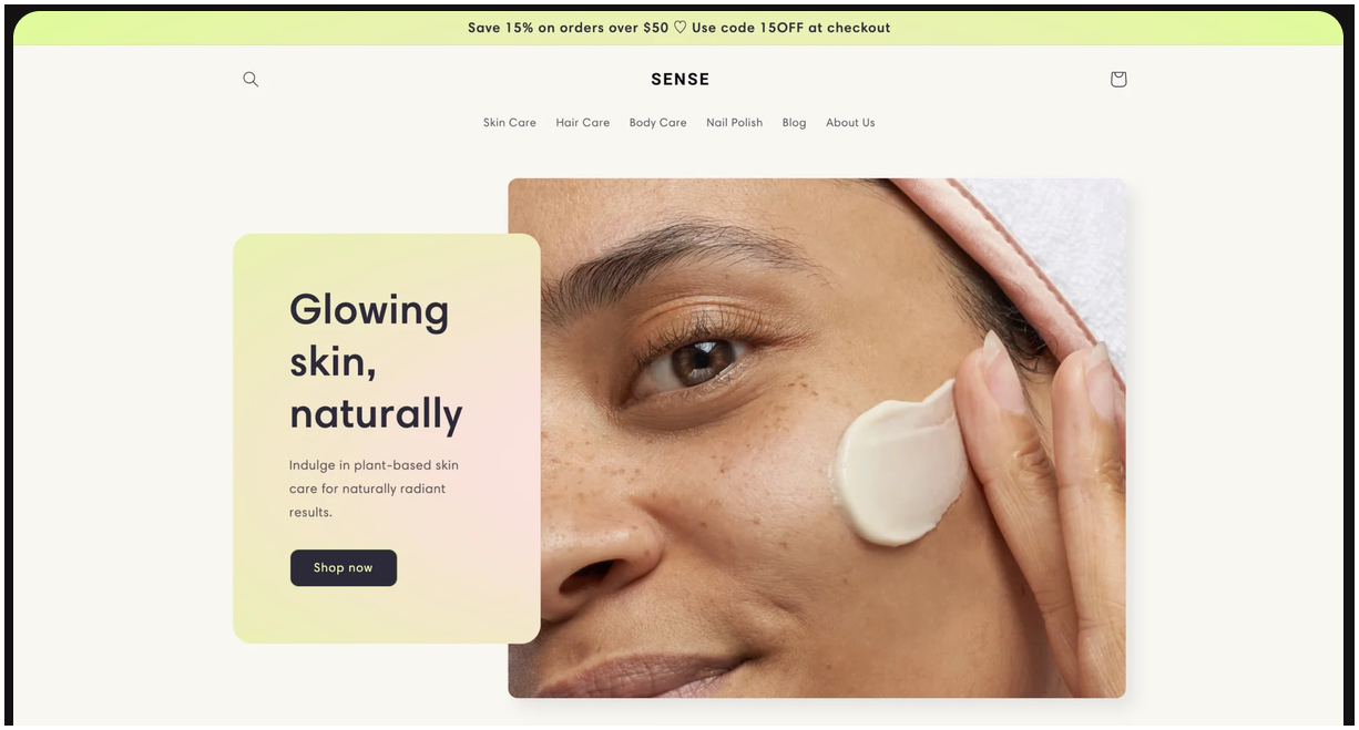
Sense fits a one-product or small catalog that needs room for product education. Shopify centers it on extensive product detail layouts. The tools include video, testimonials, and size charts. You can also add use tips and shipping details.
Product tabs were the highlight of the earlier review. They keep the material, size, care, and delivery details that sourced products need in one tidy area.
Sense's softer style also works naturally for beauty, skin care, and wellness products.
That focus makes a large imported catalog harder to manage because bigger stores need faster ways to scan many products. Sense excels at explaining one item. On mobile, compact details and a visible quick-buy path matter even more.
Only choose this preset if you can fill its open spaces. Empty size charts, bland testimonials, and reused supplier copy will make the page look unfinished.
Preview your longest answer and largest variant set on a phone. Buyers should still reach the price and purchase controls without wading through filler.
Choose Dawn or Refresh when shoppers need to browse more than they need in-depth details.
5. Taste
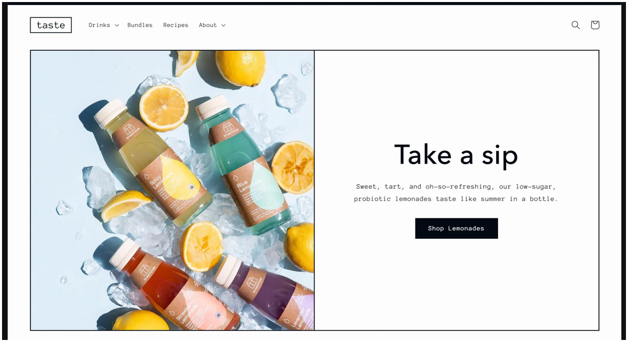
Taste works best when strong photography already carries your food, apparel, or jewelry products. Shopify pairs large product cards and FAQs with swatches and galleries. Product options and filters round out the tools.
Styled products get room to breathe. A small or medium catalog can look polished. It won't lose the basic shopping tools. Detail sections also help mobile buyers find sizes or ingredients.
Plain supplier photos reveal the catch. Taste's demo uses close product shots with good light and careful color. Mixed backgrounds and uneven light won't give the store a clear brand.
Before you commit, build one sample collection. Use a wide image and a tight crop. Add both a pale product and a dark one.
Then inspect the grid on desktop and phone screens. If crops hide key details or the cards clash, improve the photos. Otherwise, choose a quieter preset.
A disciplined image library will help Taste more than extra theme settings.
Taste is a weak choice for general stores with mixed imagery. Wait until you have real photos, then repeat the desktop and phone crop test with the full set.
6. Studio

Studio is the specialist pick here for prints, posters, framed art, and visual collections. Shopify's demo lets shoppers browse collections and filter by creator. Gallery tools and large product images support the same browsing pattern.
Its narrow purpose earns Studio a place here. The earlier review judged it best for art, and the current listing still centers artists.
Print-on-demand stores can use creator pages, featured collections, and large product cards without fighting the preset.
A focused catalog fares better here than a mixed store. Images need enough detail to hold up at the theme's scale. More space only makes weak supplier photos look worse.
Ask how shoppers will browse. Collection or creator groups can help them find related prints. In that case, Studio's gallery structure supports the catalog.
Other buyers may search by size, compatibility, or material. The gallery styling looks distinctive, but it doesn't help those shoppers use practical filters.
Outside visual art, the type can resemble borrowed gallery furniture. Your styling will determine the final look, but the preset's core assumptions remain.
See how to detect a Shopify theme when you want to separate a store's starting preset from its custom styling.
7. Spotlight
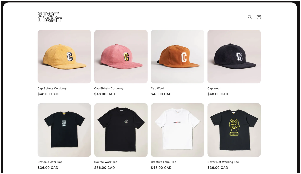
Spotlight is a quick starting point for a small catalog that needs a basic store online. Shopify describes it as a simple launch layout. Quick buy and a slide-out cart let shoppers add a product and open the cart without leaving the page. You also get filters, swatches, and a stock counter.
You can put products on the page with little setup. That helps when speed matters more than a distinct first impression. Matching images from a small clothing or accessories catalog also suit the preset.
I still find Spotlight the least attractive design here. Its demo hasn't changed my verdict. The earlier review made the same point more bluntly. If design carries the offer, skip it.
The plain design has a practical upside. Fewer choices let you build a working mobile catalog faster. A brand that needs a particular mood will outgrow it.
Give Spotlight a strict launch boundary. Use it to test products, navigation, and checkout, then switch presets when the store needs an elaborate redesign.
If early sales call for a bolder look, switch to a design that already has one. Spotlight will remain a planned test instead of quietly becoming permanent.
8. Ritual
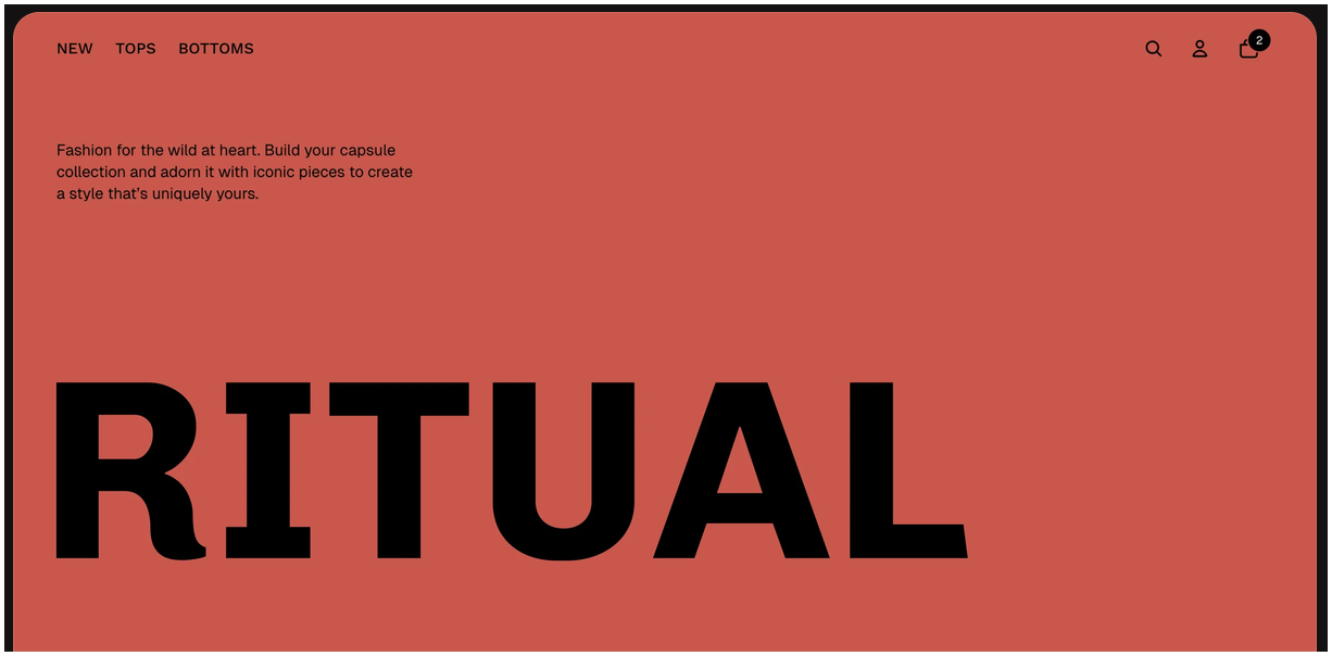
Ritual gives you Horizon's nested editing model with a bold fashion-led starting design. Shopify lists it as a free Horizon theme. Its magazine-style layouts include quick view and infinite scroll. Badges and filters are also built in.
Base Horizon is plain. Ritual gives you a much bolder start. It can suit fashion, jewelry, and accessories. Your logo, colors, and photos must fit the look.
Mixed supplier photos from a broad catalog tend to fight Ritual. Giant type and strong color compete with weaker images.
Check the logo scale, large text, variant controls, and cart drawer on mobile before you get attached to the desktop demo.
Ritual also demands firmer brand choices than base Horizon. Replace the samples with your logo, palette, promotional copy, and busiest product image.
Pass the preview when the logo stays readable, the headline scale feels controlled, the palette remains consistent, and mobile buyers can use variants and the cart drawer. If every headline and color needs softening, begin with Horizon and build the mood selectively.
You also inherit Horizon's newer support history. Use its current docs and test each required app block before committing.
The Engine-First Theme Check
The Engine-First Theme Check turns the choice into three ordered decisions. First, pick the editing model. Then choose a design. Finally, test the installed theme with your own products.
Follow the steps in order,
- Choose the engine: Decide how deeply you'll change each page.
- Choose the design: Pick the closest useful starting look.
- Verify the features: Test the store with real product data.
Choose a prebuilt Shopify store if you want the initial theme and layout selected for you. That route trades design control for a faster starting point.
Otherwise, start with the hardest decision to reverse.
Step 1: Choose the engine
Choose Dawn when familiar templates cover your pages, or Horizon when planned layouts need nested content groups. Your choice sets what you can rebuild without code.
Write down the pages you'll change after launch. Then test these page jobs,
- Build a standard home, collection, and product page in either family.
- Use Horizon for landing pages with nested content groups.
- Pick Dawn when its familiar templates cover each planned page.
Confirm your choice inside Shopify's editor. Add a test section. Build the content order you expect to use. If the editor blocks that order, switch families before styling anything.
The editing model matters less if you'll keep the demo unchanged. Run the feature check instead, then spend your effort on the products.
Step 2: Choose the design inside that engine
Pick the preset that needs the fewest changes after you add your own images and copy. Demo photos can make related themes look different. Inside the editor, the gap may feel much smaller.
Start with three real products. Run these design checks,
- Replace the hero with your own product photo.
- Fill one collection with mixed image shapes.
- Load your longest likely product title.
- Compare navigation, crops, cards, and page order on mobile.
Use our Theme Detector to identify the starting theme behind a useful reference store.
The result reveals the preset, while the store's styling accounts for everything added afterward. Return to your shortlist if a required page structure needs custom CSS. Cosmetic spacing and color tweaks alone don't disqualify a preset.
Step 3: Verify the dropshipping-specific features
Before you publish, test variants, catalog filters, product details, and checkout on a phone. These checks expose the problems supplier-fed stores tend to meet first.
Run the check with real data,
- Load your largest size, color, or bundle combination.
- Find one buried product from a crowded collection.
- Add size, material, care, shipping, and return details.
- Complete a test order from a narrow screen.
Apps, products, and markets can change how the theme behaves, so confirm each result in your store.
Before running ads, fix selectors that drop a variant and filters that hide an in-stock item.
Mark each device, app, and product type as pass or fail. Reject the theme if shoppers can't select a variant, find an in-stock product, or complete checkout.
That scorecard keeps a favorite homepage from hiding a catalog or checkout problem.
After the theme passes, build your dropshipping store with the same real product set. This keeps each design choice tied to the store's content.
Free themes versus paid themes
Paid themes buy built-in features and prepared layouts, while free themes give you a supported starting point. Sales still depend on the products, traffic, offer, and buying experience.
Shopify maintains its free themes. Paid options may bundle filters or niche layouts. The price covers the setup work those tools save.
Compare the theme's built-in tools with the Shopify apps or code you'd otherwise need.
Stay with a free theme until you can name a missing feature. Early shopper behavior will reveal which feature is worth paying for, while a free option keeps design changes easy to reverse.
A paid theme makes sense once a required feature has a clear cost. Compare a full year of app fees with the theme's one-time price. Keep the free option when the difference is only cosmetic.
Count setup time as well. A paid theme can cost less overall when it removes recurring app fees and hours of custom work.
The saving only applies when the built-in feature matches your exact use case. It must replace a cost you already know.
Try it in the demo and read its limits before buying. No universal price comparison works here because the needed theme, app, and custom work change with the feature. A long feature list means little when your catalog only needs the free core tools.
Use Sales Tracker to check whether stores using the design are making sales before you spend on a paid theme.
Summary: Pay for a theme only when one named feature costs more to add another way.
When a free theme is the wrong choice
Choose a paid or custom theme when free options block a required feature, catalog path, or brand design. Name the exact limit before spending money.
Watch for these three failure conditions,
- A required feature is missing: Your chosen app or code can't add it cleanly.
- Shoppers can't filter the catalog: A large collection won't narrow to a useful result.
- The product needs a distinct branded design: No free preset expresses its positioning.
Be clear about what's missing. Name the filter or product bundle you need. Do the same for a market selector or page structure. You can't test a request to look "more professional."
A large catalog becomes a theme problem when the menu blocks a product. Open a crowded collection, apply the needed filter, find one buried in-stock item, select a variant, and add it to cart.
Once people visit, measure your Shopify conversion rate to judge how the design-led offer works.
I'd install a free theme and publish real products first, so shopper behavior can reveal the missing feature. Pay after the same gap repeatedly blocks shoppers or store maintenance.
FAQ
Is Debutify a free Shopify theme?
Debutify offers a free tier with 26 widgets and sections directly, while Shopify's Theme Store doesn't list it as a free theme. Check its current plan terms before treating it as a free Shopify Theme Store option.
What is the best free Shopify theme for SEO?
Dawn or Horizon is the best free starting point for SEO, but the theme alone won't improve rankings. Improve your content, navigation, image size, product data, and app weight.
Are free Shopify themes as good as paid themes?
Free themes cover the supported basics, while paid themes can bundle niche features that replace apps or custom work. Pay when the named feature costs more to add another way.
How many free themes does Shopify offer?
Shopify listed 24 free themes on September 9, 2026, but launches and retirements change the total. Check the Theme Store's free-price filter for the current roster.
Can you switch Shopify themes without losing your store?
Your products, customers, orders, and store data remain when you switch themes. You may need to rebuild theme-specific layouts, section settings, and code changes.


